
VR Design Workflow, VR Usability Studies (Video Blog), VR Viewers, Website
VR Oxygen was formed to study people and the way they use virtual reality, their mental models, needs, and desires; to find, validate and solve the problems they face with this new medium. As well as to explore the process of creating a VR experience and to analyze various VR products and tools, to work towards the enhancement of virtual reality experiences through tests and iterations, to discover and work on the VR product that people will be delighted with.
Described below: VR design process and workflow development, VR viewer, video blog, product website.
Designing for virtual reality included surveys and tests to determine the type of experience to work on, and a thorough research of tools, products, and all the criteria to be considered in order to have a comfortable and delightful VR experience with the scalable number of players.
After establishing and exploring the components needed to create an MVP, I concentrated on VR interactions as a next and current step. That includes a lot of testing and iterations, as well as learning new tools and processes.
Based on the research, when the target audience with its needs and interests was found, I surveyed 19 people and conducted 15 interviews and found out that most of the people from TA were interested in an experience where they could have a maximum agency, build, create and even improvise with all sort of things, being interested in multiplayer games with social aspect. Most people didn’t emphasize a particular theme or genre but leaned more towards a possible agency and impact they could make. Below is one of the surveys.
What type of Virtual Reality content would interest you, if at all?
The main findings: All of it, Games, Building and creating VR, Visiting different places (real or fictional)
The main design process stayed the same since it’s very flexible and can be applied to almost any type of product and industry. The workflow was changed and adjusted adding more tests and rapid prototyping, storyboarding-prototyping were synchronized to be able to test each iteration in VR.
When creating a VR experience it’s important to understand why to select this type of media – the value of producing a product as an immersive VR experience rather than using any other platform should be obvious.
In the case of the type of experience that the majority of people leaned to – multiplayer games with social aspect – it’s the possibility to virtually communicate with people who are far away, to feel united with people through activities made together, such as building worlds and environments, sharing these environments, to feel physically present in a virtual space for the matter of visit or entertainment sake.
People ages 13-17 willing to play and share their games privately in virtual worlds, build and create in a safe enironmanet, learn VR tools and techniques.
Young adults 18-39 who'd like to unite with their friends and family and to explore the creativity of VR worlds.
Personal: Few or no VR design best practices, no workflow or established VR guidelines and rules that are fully proved to be successful.
People: Being far away people can’t really be together or share the same room, have a spatial influence through co-creation and interaction within the same place.
Continue identifying people's needs in VR experience in more details, create it.
Research and develop a VR design process, explore VR tools and select the most efficient ones, create and test different VR solutions.
Player's Value
Easy access to close friends and family, significant others, virtual presence and interactions at any distance.
Entertainment
Education and creativity boost
Possibility to earn money inside of thes virtual worlds for creating valuable content
Possibility to meet new people in a safe environment.
Business Value
In-game assets
Strenghtening brand authority and trust.
Continuous players' feedback helping to create better products.
Measurement of Success (for the near future, as it will change at the next level)
Positive feedback and growing user base.
Clear identification of the product to build, feature or other value to create.
Active feedback and engagement.
The next step was to determine which specific type of experience to develop. Based on the desire of TA to be able to build and create inside of the experience, have a full agency, and treating the whole process as an experiment and a opportunity to learn, I started working on a experience that was inspired by Social Platforms like Facebook, games like Minecraft, and 3D models websites and stores like Unity Asset Store.
People have their mental models and expectations which I was testing and validating, that's, why I decided to start building what people say or express they want, though they may not be sure of their own desires conserning VR or feel that they are irrelevant, or have assumptions of what they think they should do if in VR etc.
So I took it as a starting point, but decided to add and modify the environment creating a hypothesis that people might like it (for example, many new devices and features no one knew or thought about initially are now widely used and loved, of course it all was based on people's needs, problems, and motivations, which should be constantly explored), then test to confirm or decline this hypothesis, counting both in this case as a win of gaining more knowledge about people and VR.
Selecting the right platform was as well a priority, especially at the beginning stage, leaving the possibility to optimize across other devices and formats in the future.
At the beginning I chose Oculus as a platform, based on the opportunity to have a better quality in the near future (it was DK2 time).
Later on the way I switched to mobile VR based on the following aspects:
Based on the research showing that the number of mobile devices is huge and growing and the VR HMD adoption is still at a starting point due to some tech constraints and price.
Mobile VR audience is hypothetically large and the locations are widely dispersed, so the accessibility is not an issue, as well as price and simplicity in use.
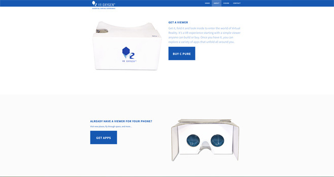
The product that was created along the way and had an obvious interest among people (Cardboard VR Viewer).
The VR HMD and mobile device portability – freedom of where and how people could experience it.
Research the existing VR tools and processes, findings, existing materials and whitepapers.
Research Users, define Use Cases and map a User Journey
Define the User Flow, create a Storyboard and a rough VR prototype to test the comfort zones, scale and interactions with TA.
Research Fiber Internet and estimated requirements for VR, Distributed Networks, Security and Encryption, Smart contracts, Cryptocurrency Market and dependencies.
More detailed VR prototype, test, iterate and repeat, PoC
Hi-fi prototype, MVP and Product/market fit, launch to test
Research analytics (Unity and other) to be able to measure performance:
Track the device type
Measure selected elements in the experience
Understand better who are the people that use this experience; their location
Discover the most viewed areas of the experience
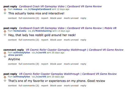
Measure player engagement, where did people look at, how frequent they change position and use the interaction methods (Unity analytics has introduced Heatmaps to visualize the spatial events). New update: YouTube announced Heatmap Analytics. In this case, it might be useful to publish some VR scenes on YouTube to receive more statistics.
Know the performance of the content accross platforms
Observation (combined results for 2015 VR events and 2016 expos with VR Oxygen as an exhibitor).
During expos and VR events I took the time to observe and interview people. I usually selected 10 participants to take notes about and showed them 2-3 VR experiences with different interaction methods and environments. First of all, I wanted to know what would be the behaviour of a New User if given a VR demo.
I as well watched people trying VR at various events: specifically, the First Time Users trying VR headsets and experiences, their reactions and behaviours, body language, expressions, often I was also able to ask them some questions in an informal chat after their experience. These tests were very casual, more as a chat/ conversation, never mentioning that I work on VR but "being a newbie", which definitely helped to gather more honest information, as well as gave me an entertaining feeling of being a secret VR agent.
Being an organizer of a big VR expo (SFVR) also helped me in gathering feedback from people and conducting observations, as well as gave me an opportunity to view and test a huge amount of very different VR experiences, tools and devices.
Among the interesting findings were:
People, when placed into VR, don’t turn around or look around for cues, they just look in front of them and wait being not aware they can move 360°, people don’t look up or down, usually ignoring the sound cues as well and not moving much even after being told they can move around, they move carefully and slowly. (10 of 10, ages 18-39, New Users)
People got bored quickly if they weren’t engaged within the first 5-7 seconds and didn’t want to continue, put down the headset (8 of 10, all ages, New Users)
Younger people were usually much more active in VR and after a short period of time were able to figure out what to do and how to interact but at the very beginning often just waited for cues to appear right in front of them (7 of 10, ages 10-17, New Users)
Most People don’t have a clear understanding of how the good VR experience should look like and feel, or have a very limited or negative (dissapointing, low-quality) VR experience. (My research and observations conducted later along the way confirmed this assumption greatly – VR Viewer: New Users and Experienced Users test
Hypothesis: Creating clear visual cues at the very beginning and positioning the UI and important elements in the FOV of the viewer will explain players they can interact with the environment (FOV at the time of joining VR – in front of the person => don't confuse with attach to FOV – it should never be done!).
An experience could have a short onboarding, if applicable, which would feel like a part or level of the experience using all the interactions and cues as a scaffolding guide. Another way to introduce people to the new elements: in a timely manner along the way to avoid possible cognititve load.
To do: Get people to understand that they can move around, and get them to understand it within the first 5 seconds, otherwise they would be confused why nothing happens.
Some of the participants assumed they could perform any gestures: People waved and made other hand movements (4 of 10, ages 10-17, New Users)
Younger People after encountering that they could move in VR tried to manipulate all the objects that were present in the environment (6 of 10, ages 10-17, New Users)
Younger People were afraid of complete darkness in VR, which could affect the navigation performance, but still liked the experience (3 of 10, ages 13 and below, New Users).
People’s arms got tired from holding Cardboard VR viewer when stayed for a prolonged time in VR, even though they really liked playing a game or viewing an experience. (all ages, mostly people ages 28-39)
An observation of people playing in Oculus and Vive as well showed that even having a headset tied to head, their arms still got tired from holding controllers. Because in real reality (RR) we don’t make such interactions with hands, don't hold our hand up for a prolonged period of time, so having arms all the time interacting with something could be naturally tiring, especially if hands should be held up. From my findings, the gaze-based interaction is one of the most simple and efficient now.
I am sure that the hardware and software will evolve much during a relatively short timeframe, but I found it right to start creating within the current constraints.
Probably VR will be adaptive – optimized (downgraded/ upgraded) for different devices, inputs and outputs (controller, button), have a cross-platform support.
Searching and going through more than 20 mobile VR apps every week for several months and time spent as an SFVR organizer helped me to develop an eye for what is good for VR, what works and what doesn’t. Observations and tests continued to help me with evaluations and assumptions. It was easier to understand wishes and needs of the players, their reactions to the experience.
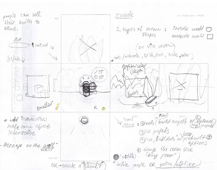
I started working on the product that has a strong social aspect keeping in mind that it will change greatly over the course of the development, treating it as VR exploration.
The experience was started with the environment based on my research, which revealed people enjoyed building and creating, showing their builds to others. The avatar creation was set for the next stage of development based on my rasearch that revealed – people are more interested in sharing unusual, creative and detailed environments which they could interact with rather than being in an empty room but together with a friend (the other avatar). Due to some technical constraints, it wasn't possible to create both, environaments and avatars, at the same time which would be ideal, and the avatars were selected as a second stage in the project but not underrated, assuming that seeing the reaction of other people would be very important for players, same as possibly trying to establish some connection in VR.
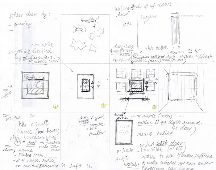
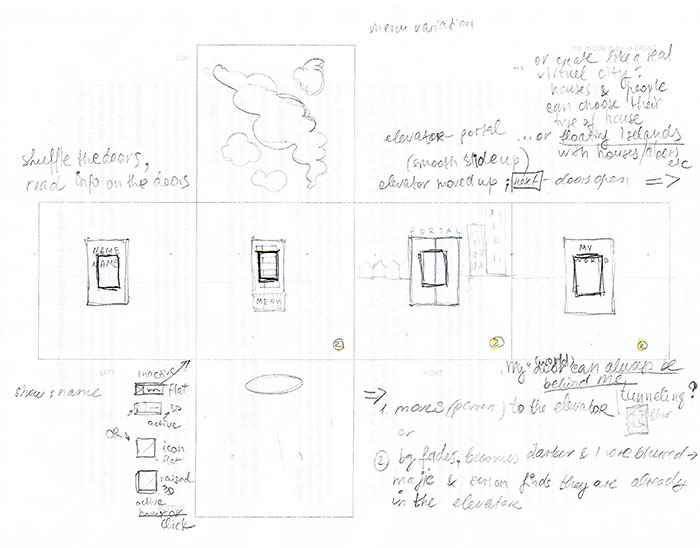
The working title was selected as “Doors”. Various names were considered and to see what people think about them I conducted short interviews where I asked what assosiations do they have from the selected words including Doors. Doors was selected as the best and most close to the intended meaning (a place where everyone can create anything you want, a world where people could express themselves, gain the new possibilities, a new way). The name is a working title, which is planned to be tested again along the way and may be changed.
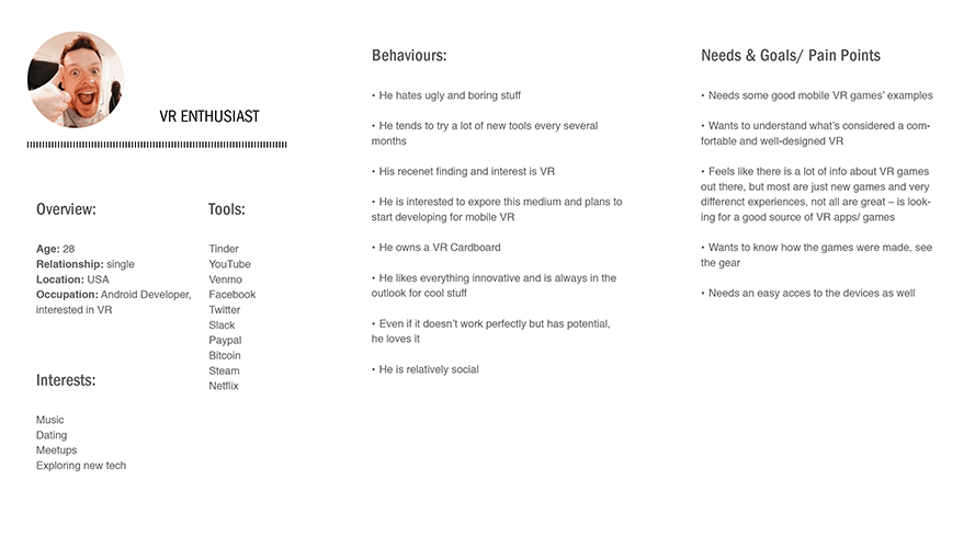
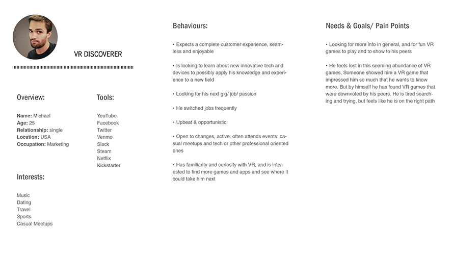
Based on the research and qualitative data, the following Personas were discovered: World Changer as a Primary Persona, VR Enthusiast and VR Discoverer as Secondary Personas. More of the Persona creation process is here.
To better understand the experience functionality, how it would work and to brainstorm it once again in all the details, I started working on use cases. An example is below:
Use case 1. Visiting a friend and creating a world together as an entertaining experience
Player – Alex (World Changer)
Preconditions: Alex is home and has some free time to relax and have fun.
Trigger: Alex got a VR headset a while ago and watched online videos presenting a VR network where players can build worlds and even earn some money.
Basic Flow:
1. Player enters is in VR wearing their HMD.
2. A VR Standalone HMD delivers a splash screen of the experience with the choice to proceed
3. Player pushes the fuse button; The fuse button shows the timer and after a wait time the system proceeds to the experience
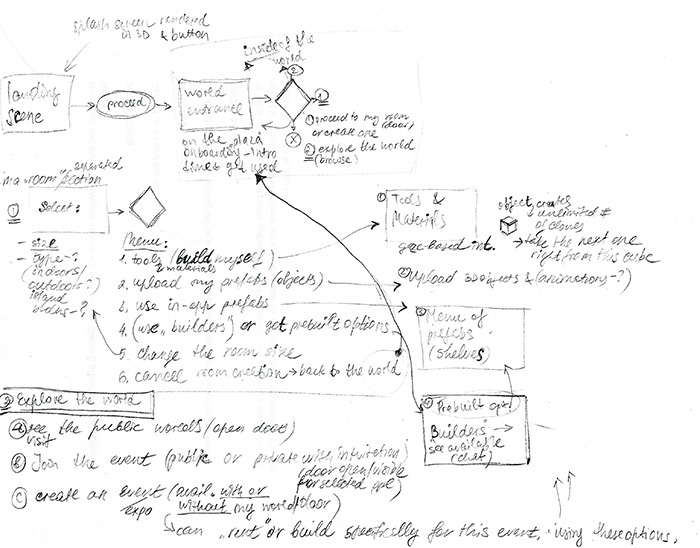
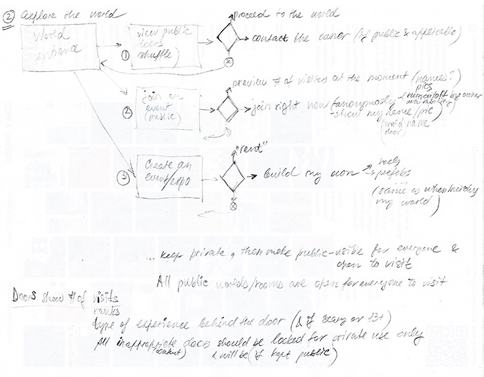
The flow would be assisted with cues, there are two main directions in this experience: creating player's private world and exploring, browsing the outer world. I started with the draft of main interations, which I am adjusting and elaborating along the way. Here is the flow I started with:
To visualize and document the full end-to-end experience including the emotional part, I started working on User Journey Map. In this draft I mapped motivations, actions, interactions, touchpoints, emotions and feelings, possible failures.
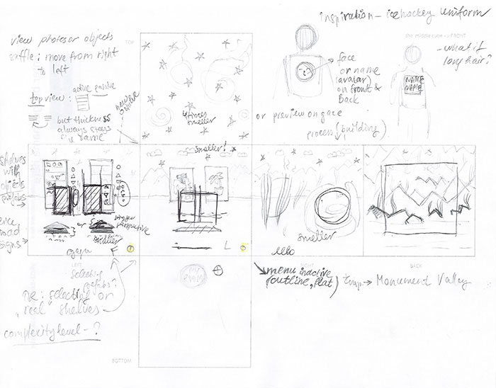
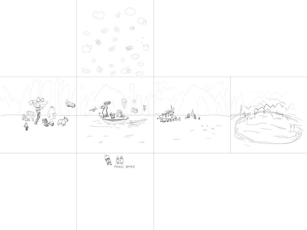
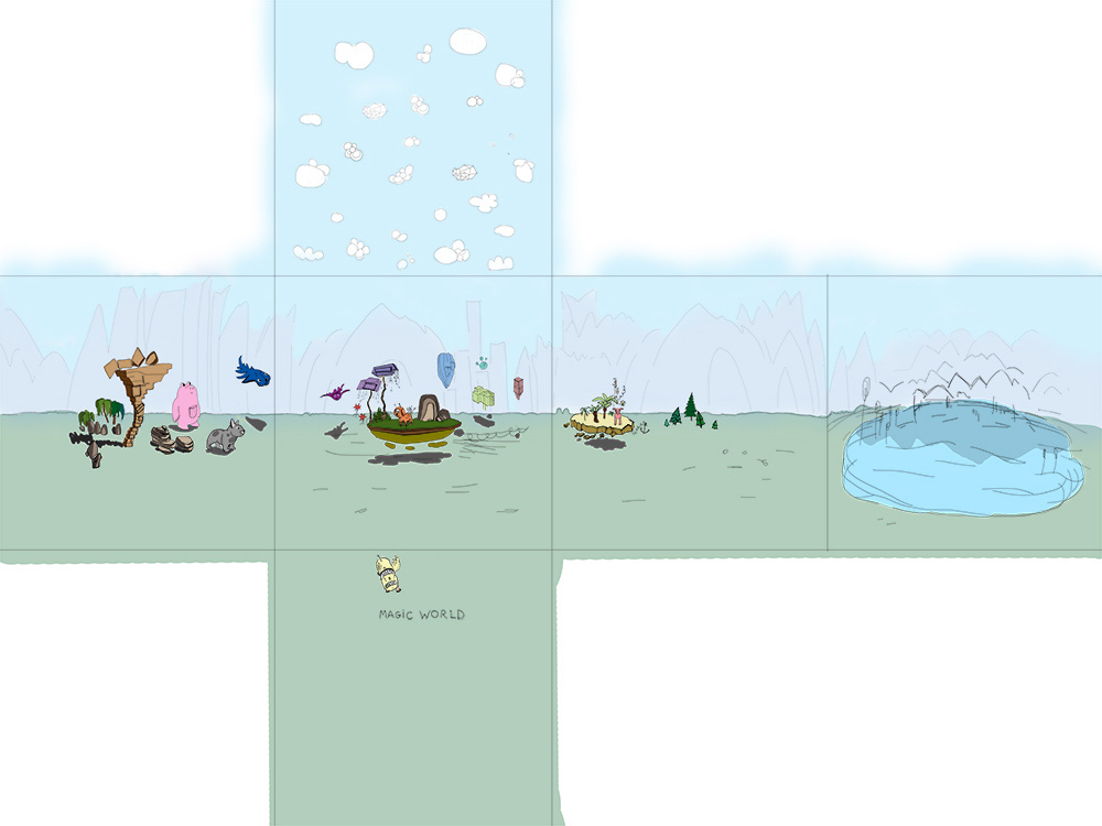
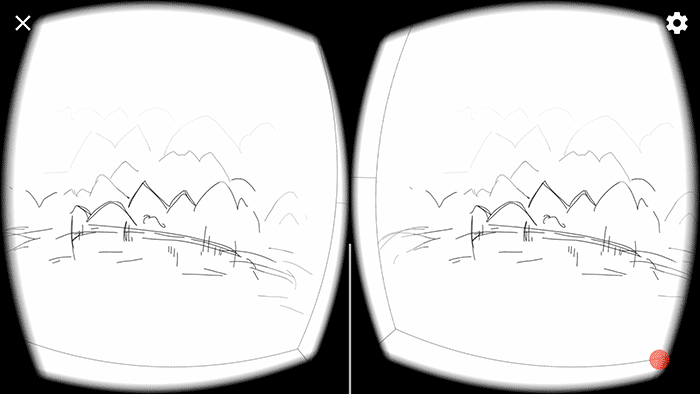
Next step was to start sketching a storyboard. Since it's a 360° VR experience, I created spherical views based onthe user flow. I also learnt about the specific degrees of comfortable viewing and with a very rough approximation was incorporating them into the storyboard.
Spherical Storyboarding was used to roughly visualize the user flow, decide what should be in front of the player, to the sides and behind.
It was clear that Spherical Storyboarding style isn't appropriate for further and more detailed Scene Sketching and Rapid Prototyping (to be able to test the scenes in VR) but it's great for a starting point. Currently I use Spherical Storyboarding to quickly draft the flow and decide what should be in the scene – something similar to blocking and staging for a play or film, but adjusted to VR.
Next, I switched back to the traditional way of storyboarding with minor changes such as drawign some details beyound the frame. In real life we don’t see all 360° view simultaneously, neither focus on 180° view, but we have a focal point and our side vision is blurred, we can approximately tell what’s happening on the left and right, but not in detailes unless we turn and focus on it – changing the focal point. Based on this observation I started drawing Focal Point Storyboards which then resulted in switching to cubemaps. Cubemaps are convenient to sketch and are perfect at this stage, because they create a full 360° view to check the scenes in VR, unlike all the previous types of storyboards.
Before settling for cubemaps, I went through various tools to find the best one for Scene Sketching and Prorotyping, among the tools were: GoPro VR Player where I could upload the equirectangular images, A-Frame where I could view a sandbox in VR, Krpano Panorama Viewer and other tools were explored while looking for the best solution. I also tried different layouts but almost all included equirectangular images, different types of panoramas, which due to the perspectives were unnatural to sketch.
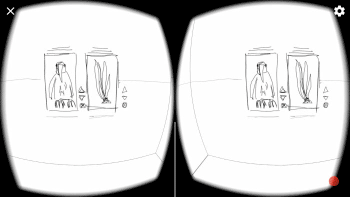
The importance to test the experience in VR is essential, because it always feels very different from screen and viewing in VR, especially the scale and the UI placement. I decided to create very rough small prototypes to confirm the scenes: comfort zones, location and scale.
I used cubemaps not only for full scenes, but to quickly preview the objects and UI elements in 3D, their scale and depth, sometimes combining parts of several scenes in one cubemap.
Cubemap is a good way to test the VR storyboard and to immediately make iterations, then check these changes again in VR.
Based on the findings from my research I concluded that all the objects inside of the experience should be interactive and useful or not be present at all, behaviours – easy to understand and recognize, the design should be clean and minimal, comfortable for eyes and mind, not overwhelming.
Everything in VR should feel real, but not in the meaning of being similar to the RR wolrd, but in the meaning of feeling the presence and probability to interact with the virtual world. Also, consistency plays one of the main roles to help the new users in learning the VR interactions and environments, and in being able to predict players' behaviours, to meet their expectations.
Naturally, people anticipate consistency, which is clearly shown in Gestalt psychology and is used in traditional design.
I decided to start with adding some of the familiar objects like doors to support people’s mental models, some of the instinctive and intuitive affordances from RR. But encourage to create literally any environment.
I also started thinking about the possible sound cues.
I chose cubemaps over equirectangualar images and cylindrical panoramas because of its simplicity in terms of sketching – no need to draw in perspective, and a higher precision – it’s full 360°, when pamoramas are 360° x 180°. Of course, there are tools to convert cubemaps to equirectangualar images and vice versa, but what I found very convenient in cubemaps is that the cubes (sides) borders help to feel the size of FOV better.
At the moment, the most used template for me is a 6-sided skybox made from cubemap.
I tried column and row cubemaps and settled on horizontal cross layout, because this template is very natural for drawing 360° view. Later, I started drawing each view (each cube) separately, which can be timesaving when using the 6-sided sandbox in Unity, specifically if testing seperate objects or UI.
To view the cubemap in VR I create a skybox in Unity and make a build for Android or iPhone to test in Cardboard VR Viewer. It’s a quick and convenient way to sketch fast, test and iterate immediately, test again and so on until it’s ready for the next step. And once built, it’s a fast way to check the other scenes in VR within the same file.
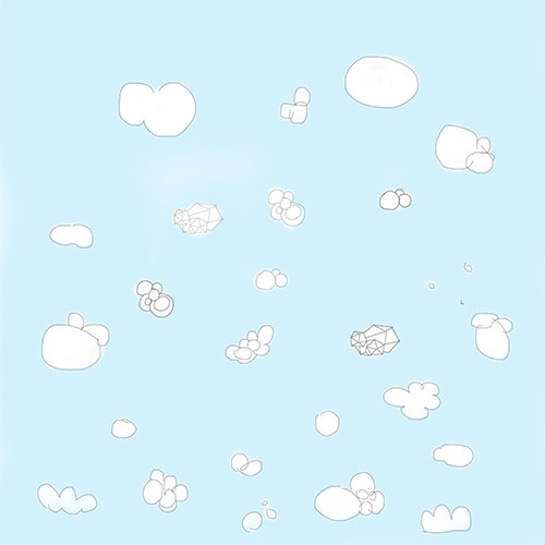
Below are some of my first sketches for VR. They were too big, but I could immediately establish and document the confort zones right on the sketches.
In order to keep the size and proportions, I created a cubemap layout, then printed it out and kept sketching.
My first drawings were too big in scale and too close to the player, as well as were some issues with comfort zones.
I documented these issues immediately while looking into the scene in VR and fixed them, so the next drawings kept getting more and more comfortable in VR.
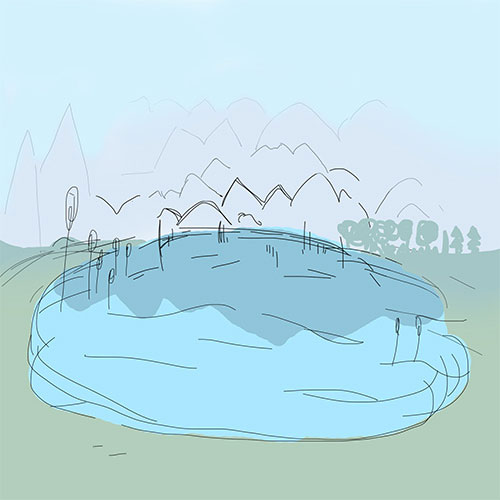
Below are some scene and cubemap examples. I use this method to test scale and depth of particular objects and to understand the comfortable and suitable level of details for VR. If colored, it also helps to identify the comfortable color palette for the experience.
After some time of storyboarding, between spherical prototyping and cubemapping, I started exploring the components needed to create this VR experience. I looked into:
Fiber Internet and estimated requirements for VR, Servers, Distributed Networks, Security and Privacy, Self-Encryption, Smart contracts, Cryptocurrency Market research and dependencies.
To establish technical feasibility of the product, I analyzed server/ hosting types and costs. Below is a brief summary of my research.
The following would be included:
Login (authentication) server
Player database
Item database
World/ Room servers
Group/ Meeting servers
Modertion (24/7)
Servers and Hosting costs
Electricity Costs
Network Support
Customer Support
When researching about the server I considered:
A number of players in total
A number of players active at any given time
A number of players on at peak
The distance between players, locations
I kept in mind that it should be scalable – to support a growing playerbase. The price could be the main concern.
I looked into cloud servers to compare Cloud Server and Dedicated Server. The cost and security concern can be present.
I explored fiber optic internet to have an understanding about the fiber technology and to find solution to increase bandwidth greatly. This type of low-latency and fast internet could work, but one of the major constraints kept being the high cost, if not take privacy and security which are about the same with previous solutions.
Security must be at the high level in the experience, based on TA needs and requirements.
Thinking about the ways to minimize the cost and performance of internet and to make all operations secure and private, I spent significant amount of time exploring possible solutions such as distributed networks that utilize P2P technology and work on creating a decentralized distributed internet without relying on blockchain, which is important for comfortable experience and user base scalability.
After an extensive research and several interviews, I concluded that blockchain technology can not be utilized by VR yet (at least, not at the moment) since people would need to set up, store/ retrieve data – perform all the possible operations in VR world instantaneously, and blockchain consensus algorithm is inefficient in terms of speed, which is unacceptable in VR. An effort to increase the speed may lead to the security issues, which is unacceptable as well. Thus, blockchain has a lot of technical limitations to be considered for VR use, but I keep an eye on this technology and on several projects in perticular in case it changes. Also, monitoring the SegWit (Segregated Witness soft-fork and may be hard-fork) process and related benefits it may provide.
One of the discovered technologies that could be suitable for VR lets a website/ app to automatically speed up when it gets more players, which is opposite to what usually happens to a website or app. And speend and latency matters are essential for a comfortable and immersive VR experience. (the tech. is currently in development)
I also explored cryptocurrencies and their value dependencies on the market, smart contracts, and the process of utilizing crypto assets and coins. I periodically look for the new companies and recommendations concerning this topic to be up to date, ask the crypto community for their feedback and advice.
The decentralized internet is not ready yet, but it's definitely a brilliant idea and I am watching the companies who work to make it happen. And now the most realistic in terms of implementation and technical constraints would be fiber. There are various estimates for different quality VR experiences requirements ranging from 50 Mbps to 600 Mbps for high level VR game but it won't be validated until it can be tested properly with VR multiplayers. The bandwidth also plays an important role in VR MMO.
Among my discoveries was an Internet simulation, one of the great features of which are cloud-based platforms that allows to use many servers simultaniously. Another positive and highly important component is that it allows using a large number of Unity3D instances (or any other engine), it makes it possible to create a large number or functioning creatures, weather system, the whole world with its ecosystem. This technology solves the problem of handling large numbers of concurrent players across various platforms within one virtual world. I currently study this technology, based on my research – it is among the most viable for VR MMO at the moment.
During my crypto world reasearh I continued my observations at VR expos, and based on the findings I started working on VR Oxygen’s own Cardboard VR Viewer which then was followed by VR Oxygen’s video blog and website redesign.
After the 360 video exploration I went back to work on the VR project.
Based on the new reasearch I made and some business goals and constraints, it was decided to switch from Oculus Rift to Cardboard VR Viewer and to concentrate on interactions in my VR prototypes.
I understood that switching the HMDs will greatly affect the input method. My goal is to explore and test interactions with the minimal OR natural use of hands in order to find the way to make VR more comfortable. VR cardboard viewer is a good tool to tests gaze-based interactions. Some interactions are made to be replaced by controllers, when the experience is adapted for more advanced VR viewer (adaptive VR). The hand interactions are documented to be tested with an advanced VR HMD.
In real life we don’t interact with the environment the way we often have to in VR, such as actively look around, have hand up for the prolonged period of time to perform tasks etc., which may cause fatigue. The gaze-based interaction could be applicable to any strapped HMD as well, it could limit the "hands up" interactions (or allow to make them short and not too frequent) to avoid hand and neck fatigue.
I switched to cardboard keeping in mind that either the phone-based VR will evolve, or, most likely, a new standalone, minimal in size, light, easy to use VR HMD will be available. As well, after some time of cardboard testing, it's planned to go back to more advanced HMDs with controllers like Oculus or Vive to test the documented hand interactions.
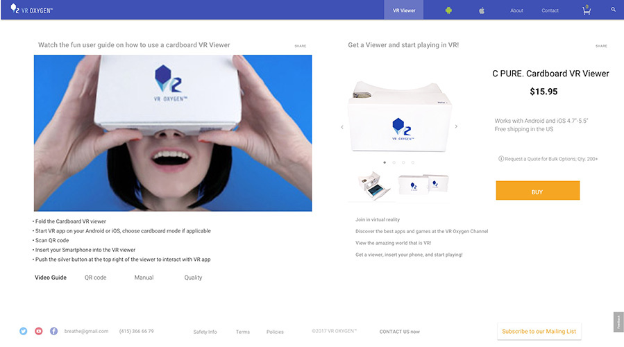
To test the VR experience I use VR Oxygen's Cardboard VR Viewer.
It has an obvious and interesting constraint mentioned above – arms get tired holding the viewer.
Solutions:
1. Create a very short but fun experience.
2. Have the headset be strapped to the head and create minimal interactions using only gaze and button.
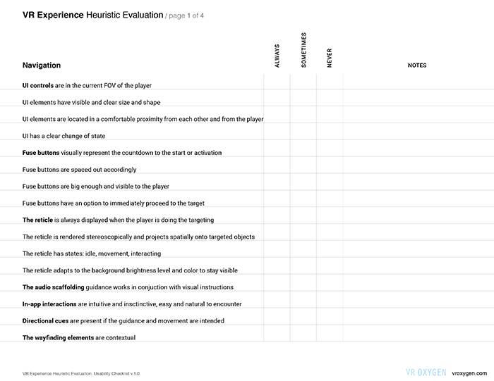
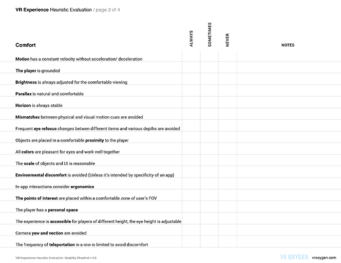
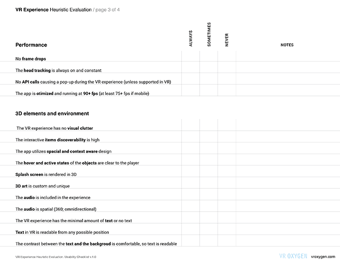
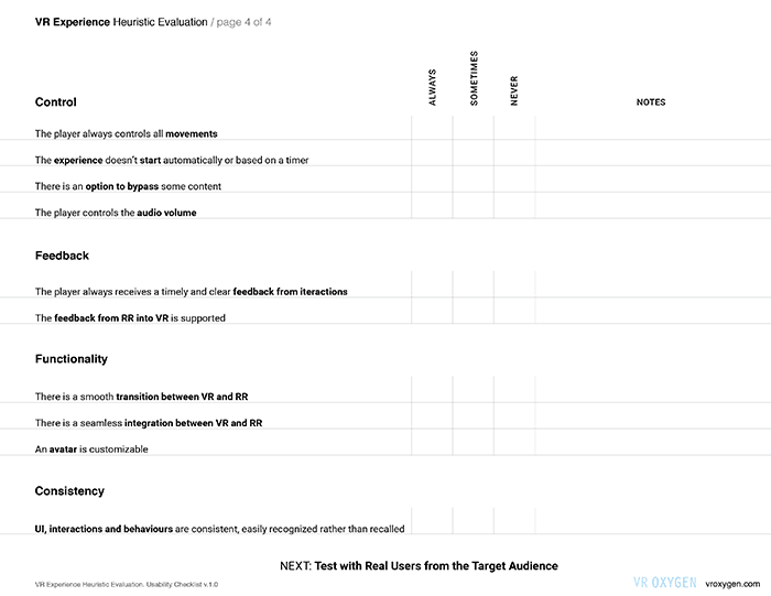
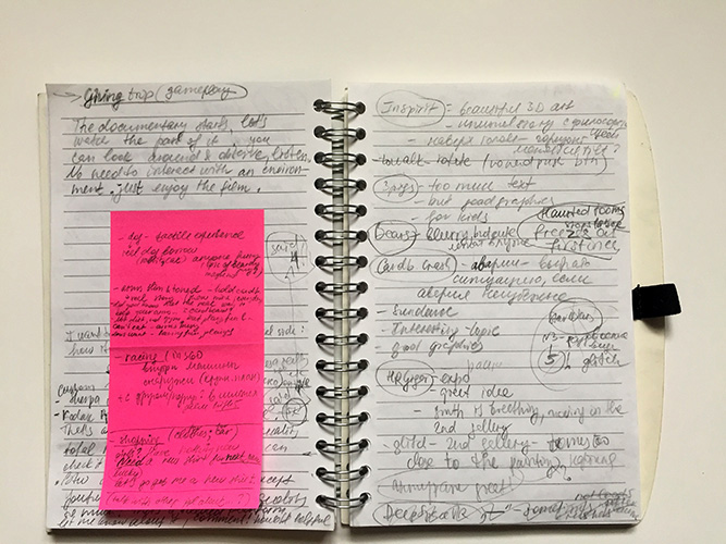
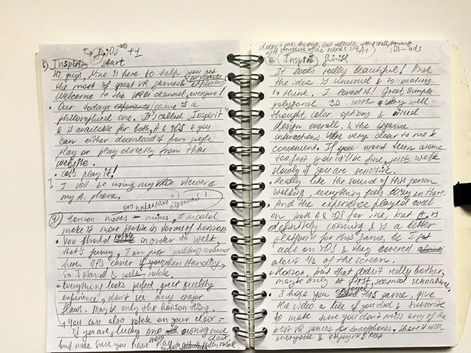
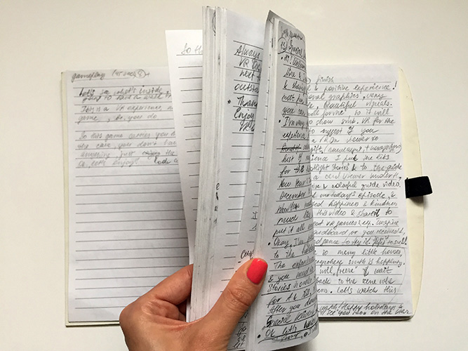
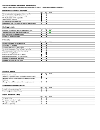
Based on my reasearch and observations, as well as games’ tests for vlog, and on some additional resources, I created VR Heuristic Evaluation. It’s a check list that helps to make sure the major VR heuristics are followed. It’s not a set of concrete rules, but a flexible guide which everyone can apply depending on the experience being tested. Planned to be an online tool, will be implemented on a new website. It will be iterated along the way. Below is the first iteration, which is now available online: VR Heuristic Evaluation
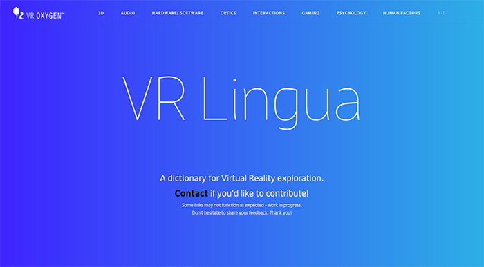
The other material that currently is being worked on is VR Lingua – a VR Dictionary. Along the way, from my very first days in VR until now were accumulated over 100+ pages of VR terms with definitions and links, which I first was collecting for my own convenience. Then when the amount of pages started nearing 100, I decided that it could be a useful material to share with people who start exploring virtual reality.
Considering the amount of material, card sorting isn't convenient for categories' testing, and it was decided to put it online and encourage people to leave feedback if they think it belongs to the other category or if the whole idea with grouping doesn't seem convenient. Currently, the terms are grouped in several categories, with an option to view words alphabetically. VR Lingua will be located on VR Oxygen's new website. The full version is currently available in pdf. The VR Lingua will have some educational aspect which I'm not documenting here yet, but there will be a method to check the knowledge in a fun way. Contact me if you'd like to know more.
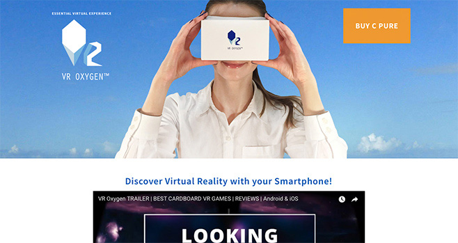
VR Oxygen strives to provide all the essential tools needed to start exploring VR, with an approach to show what good VR is and to introduce it in a right way.
Exploration and initial research showed that people were really interested in buying VR Cardboards (end of 2015-begin of 2016):
At various VR expos people approached and asked where they can buy a cardboard
People liked the cardboard giving away that I held at some events, asked if they could buy
DK2 lenses were close to Google Cardboard lenses (lenses were checked using the resolution plate test), but the cost was much higher + it had wires and required a set up (main concerns of people I surveyd)
iPhone and Android people are growing globally, money spent on mobile gaming increased
The information gathered from several research organizations was positive about cardboard usage and distribution in the end of 2015
Based on the above findings and observations it was decided to choose mobile VR as an initial platform and select Cardboard VR Viewer as a product.
People aged 13-17, casual gamers, mobile gamers and their parents
Young adults (18-35) that are interested in new technology
Educational organizations (Schools, Museums)
Vague understanding of the VR adoption, mass market interest, marketing ways
People have no clear idea of what a good VR is because of the huge amount of low-quality VR Cardboards
Understand the mass market interest, marketing ways, people’s assumptions about VR
Understand the VR adoption stage
Help the VR community grow, show the good VR, instroduce VR as a tool to share the experience
Establish the VR Oxygen brand, show its values and goals
Create a company, set up e-commerce, get customers, sales
Explore VR distribution channels
1. Research
Product discovery, market and user research, competitive analysis
User Exploration: Guerrilla Research, Interviews (at VR events; expos)
Manufacturing processes, tools and materials research
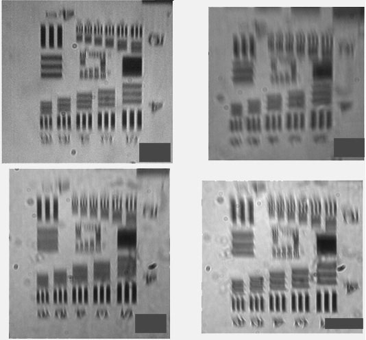
Lenses tests from 6 different cardboards using Resolution Test Targets (RTT), compare results, analyze
Research optics companies, get information about the materials and specs, get quotes for chosen materials and lens types
Purchase sample lenses with different selected characteristics (where available), test them with RTT, compare, evaluate price vs. quality, establish the maximum, limiting quality that makes sense to aim for (as assumed – after crossing some level of parameters the lens is wasting those parameters anyway because the eye can’t pick up any more detail. – Confirmed).
Other vendors and manufacturers research and estimates
2. Evaluation and Manufacturing
Obtaining/ buying samples from manufacturers
Vendor and manufacturer vetting
First customers acquisition, publications and sales (Kickstarter)
First batch manufacturing
Fullfillment research, vetting, set up
3. Validation
Demos at several expos, surveys, interviews, observations
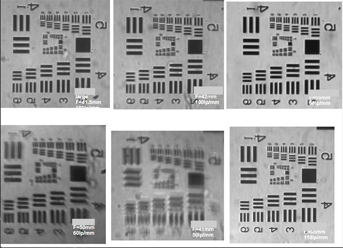
All the RTT evaluations and work related to optics were done by an Optical Physicist
To understand what is happening in the market, what is the quality of these products and if there are any flaws, I conducted competitive analysis. As well as to understand how the VR viewers product websites are structured, what is the buying experience for the people. To figure out how to make cardboard market better, and what form VR Oxygen website should take.
Process: some time was spent testing cardboards with Resolution Test Targets and exploring websites of several selected companies. It was possible to identify what each did well, and what each could improve.
Based on in-person tests and interviews the following assumptions were made:
Educating people on the quality of VR viewer will make them more aware and informed, which would influence sales positively.
Showing the research and test results will show that VR Oxygen is a reliable and trusted company.
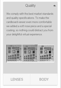
Creating an oil-resistant coating and overall comfortable viewer will make people more confident in sharing their viewer without being embarassed.
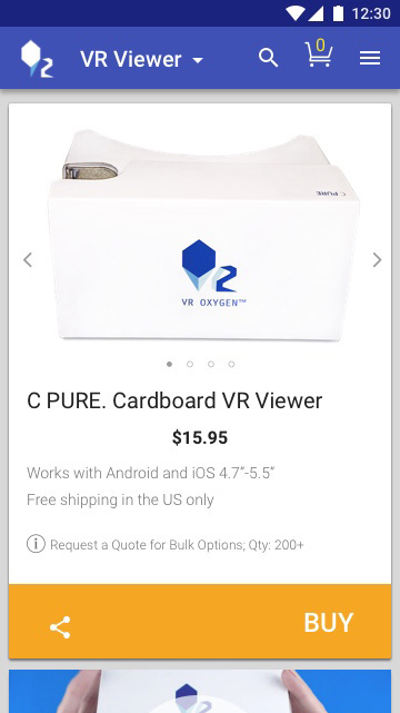
The competitive analysis was very helpful in determining a gap and deciding on a feature list for the viewer (oil resistant coating + soft nose piece, color), as well as for the website – to create a seamless experience: get a viewer – get an experience, and while waiting for delivery – preview VR games online, select and download the experiences to play.
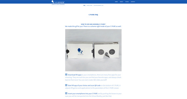
Having an experience in manufacturing, I carefully researched and selected an equipment needed, machines, and material vendors – to be precise with the specs for both, the box and the lenses.
Several samples were manufactured to see the production quality and to evaluate the features. Next stage was the first batch production.
Some of the discoveries were made thanks to the pitfalls and failures of the first manufactured batch: part of the viewers was considered defective due to the wrong lenses. Despite this, it was decided to test both, the first and the second batch viewers as well as some of the previous samples of various quality were added to observe and compare people's reaction.
People didn’t know that the viewers were different in quality. The participants were aged 9-35. Initial results were mapped and split in groups based on age, New users and Experienced users. Research was done at a 2 day-long expo/ fair. The test results and discoveries are below:
7 of 10 Experienced users aged 9-35 had a very bad first VR experience (low quality lenses, wrong ipd, wrong cardboard box) even though they stil liked it.
8 of 10 Experienced users showed they were completely unaware how to identify the quality of a viewer and what is a good VR Cardboard. People's behaviours and reactions indicated that their previous VR experience was extremely poor in quality. It was a big discovery.
Conclusion followed: Market is flooded with very low quality cardboards and most of people are unaware of it. People either thought all cardboards were like this sample and it’s impossible to have a better quality, or thought the good viewers are only produced by Google.
After these results it was decided to purchase more of various cardboard viewers from different companies, the viewers and companioes were selected randomly and from the funnels that TA would use (amazon, e-bay and directly from some companies, all of them were very cheap in price. After tests with the Resolution Test Tragets it was revealed that ALL of them were made not up to Google’s standards even though claiming they were. Resolution: 90% or more of the VR Cardboard market is flooded with low quality viewers.


This, on one side, made VR Oxygen as one of the relatively few up to specs manufacturers, on the other hand, if the majority of people has an initially wrong impression it’s a very uneasy task for a small company to reassure them. Younger audience (9-18) was much more tolerant in their judgments and mostly extremely positive even with the defective viewer tests.
9 of 10 New users aged 5-18 have found VR very interesting, exciting and immersive.
10 of 10 New users aged 8-22 intuitively knew how to use it.
7 of 10 Experienced users thought it’s very easy to buy lenses and make a good VR viewer (which is true in theory, but barely possible in reality. Same quality lenses as by Google specs per pair cost is much higher than expected by people). Lenses sold through regular funnels for aound $2 are low quality lenses with wrong focal length or other defects like low resolution (lp/mm) and a low surface quality – much below Lambda/4 (100% of lenses bought through usual channels were of this quality).
8 of 10 New users thought the current price is very low price for such product and would buy for higher price.
6 of 10 Experienced users thought it’s actually a very cheap product and very easy to manufacture – cheaper than it’s actually is in a wholesale price and manufacturing price for large quantities.
Interesting finding: An OPPOSITE thinking = New users vs. Experienced users.
Another very curious discovery: All people (mostly, experienced users) thought that "Google Cradboard" is a common noun (common nouns name general items, for example: a chair, a table, a dog, ...a google cardboard). People thought what they tried was a Google Cradboard too. Noone refered to this type of viewer as a "cardboard" or as any other name, only "Google Cardboard".
Knowing that I will communicate with people of very different age groups (children) and abilities, I reviewed the Ethical Guidelines before the events to make sure I comply with all the possible situations.
User observations validated the assumptions about the oil resistant coating, soft nose piece and quality in general. When comparing, all people noticed that uncoated viewers were getting greasy and unpleasant, favoriting the VR Oxygen viewers with oil-resistant coating and a soft nose piece.
As well, the demand and willingness to buy the Cardboard viewers were validated. All viewers were usually sold out during the events/ expos.
The following problems were found:
ALL people wanted to find content easily and fast – right after purchasing the viewer expected to immediately get a VR games source.
Market is flooded with super low quality cardboards, both lenses and box manufacturing.
Hard to make a right choice of VR Cardboard, too few info shown on the websites: no brand shows details on the lenses, the only shown are FOV, diameter, optical surface curvature (biconvex) which don't indicate the quality of the lens.
It was both, a Strategic research – to get a better picture of people who use this product, and a Tactical Research – to understand what to build next (such as vlog as the results showed).
Everyone in the photo was asked for agreement/disagreement to post the photos and was explained the purpose of it. All the participants listed in the photos gave their permission to use their photos.


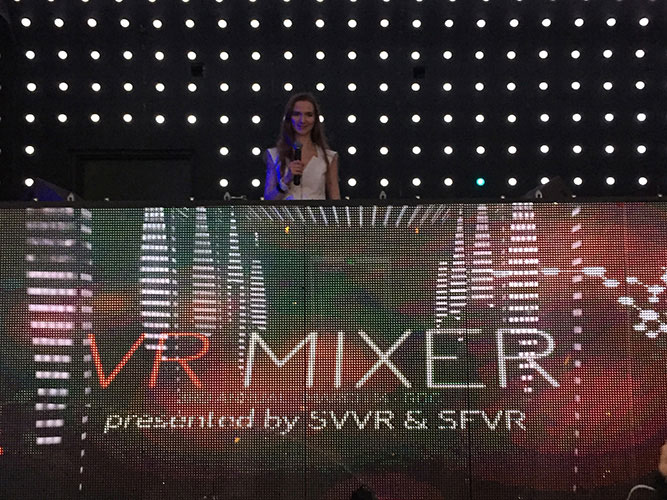
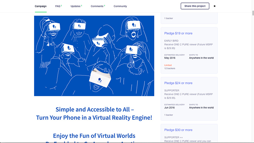
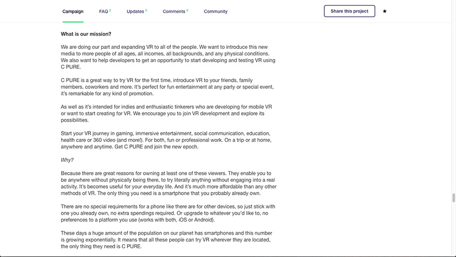
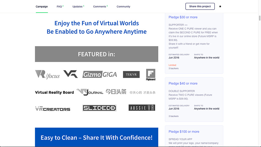
Kickstarter was used as an inital platform to acquire customers and to gain visibility through publications, to start conversations with people, prospective customers. It was the first public appearance of VR Oxygen.
The research and preparations for the Kicktarter took approximately 2.5 months. The campaign duration was 28 days, it included promotion, communication with bakers, and all other activities related to the campaign.
Announcing the Kickstarter at VR Mixer-2016 in San Francisco:
Problem arised: The first batch was defective.
Solution and Strategy:
Change the manufacturer and vendors. New evaluation and vetting
Acquire samples, document the details, request assurance and documentation from the new manufacturers
Create a more detailed agreement
Have a quality control stage for each batch
Have a third party between the actual manufacturing factory and VR Oxygen
After all of the above was ready, I decided to continue looking for a new manufacturere due to the following issues that would be present, otherwise:
Lead time almost doubled
All stages and chek ups took too much time
Third iteration on the manufacturing process:
More research and negotiation was done
The issue was fully resolved and the manufacturing in now the US
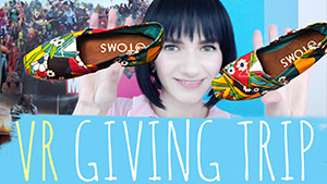
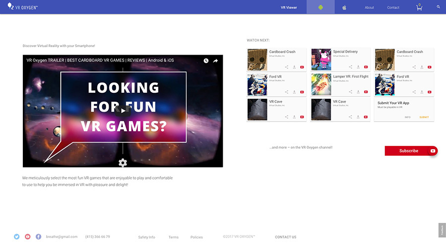
After working on VR Oxygen brand, establishing philosophy and vision, I developed a Brand Strategy that included a Video Blog, an Index (“Best VR Games for Cardboards”), and a Brand Voice. Vlog is set to work in conjunction with the new product website creating a loop – the vlog is leading to the website and vice versa.
To help people find good VR content easily without spending hours looking for resources and games, or being dissappointed after a bad VR experience, to get a game preview before proceeding to download and play.
After in-person interviews during a fair it was the #1 question of ALL people who bought VR Oxygen viewer – where to get (good) games? Experienced users shared their pains: they couldn't find good content, spent a lot of time searching but were dissapointed when didn't find any good quality games.
First, I added the links to some selected games with short descriptions. During tests it became clear that people want to have more imformation, to preview the game. They also asked which game I would recommend etc. So was born an idea to create a video blog in order to:
Create a better Customer Experience when after purchasing the viewer the customer will have a list of VR games and apps to start with, while waiting for their viewer to be delivered people can start exploring VR games – watch reviewes and decide what they’d like to try next.
Establish brand authority and visibility
Increase online sales
Find and engage more people from TA to participate in usability studies of VR UX
People ages 17-35, casual gamers, mobile gamers (new targets: 13+)
Young adults that are interested in new technologies, YouTube browsers and Reddit people
People who own a Cardboard VR viewer
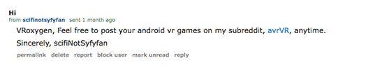
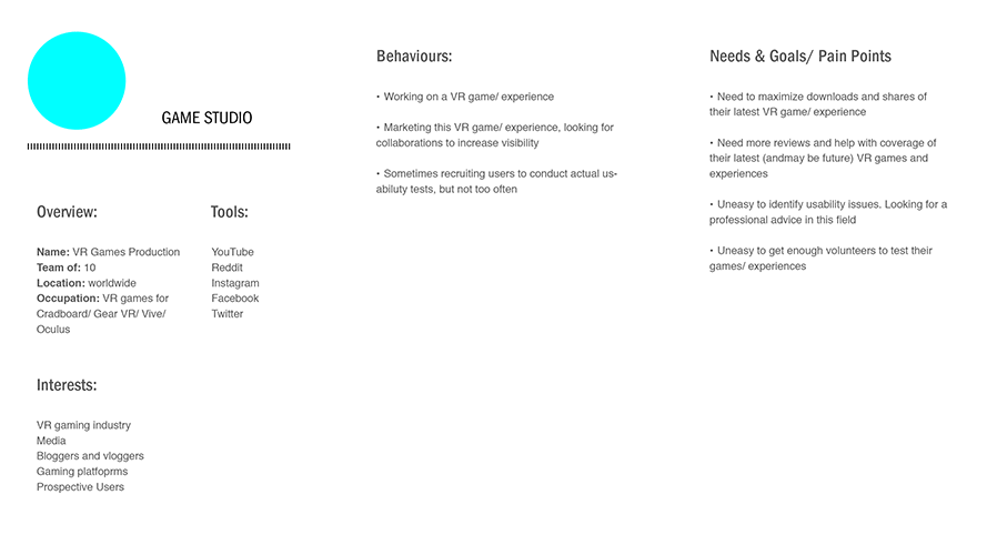
Gaming/ VR companies who are interested in featuring their content on VR Oxygen channel/ get consulting in the fields of VR UX and usability
Hard to find good VR games/ experiences for Cardboard VR. There are many channels, but most show just any or new VR games, not the best or selected ones.
People get introduced to VR in a wrong way, often with low quality apps and viewers. People become desperate in finding experiences they could like and abandone VR as something “not ready”, blurry, glitchy, or only for games.
Establish brand authority and get more visibility
Become a platform for an easy and fun VR discovery – only the good quality games
Encourage people to create more of the great VR content and to share their experiences
Help existing games to get better (better UX, UI, comfort etc.) – consult
Attract more people into VR, help growing the user base and community
Increase online sales
Recruit more people from TA to participate in usability studies; get feedback from engaged subscribers
Research the popular video blogs, observe the TA and study analytics to understand what does TA watch.
Research and acquire equipment needed to shoot a video blog.
Create and test MVPoC to test the assumptions, see if people will like an idea, see how they react. Start with minimal risk and investments, iterate based on real customer feedback.
Customer Value
Easy access to a good quality VR content together with the cardboard viewer – all in one place
Convenient payment options: credit cards, bitcoin
Games positioned as best, game advertisement (for game studios as customers)
Consultancy and user testing (for game studios)
Business Value
Increase in online sales, better conversion
Strenghten brand authority and trust
Know the people better – create better products – get more sales and engaged people – get more feedback – know the customers...
Measurement of Success
Online sales increase
Positive reviews, customer engagement – feedback, comments, shares/ retweets (User marketing), mailing list sign-ups
Games proposals (game studios and individual developers)
Subscribers and views count – better ranking
Conversion rate increase
Business offers
Before publishing the vlog, about 2 months were spent researching the existing popular among the TA vlogs, exploring Youtube tools, vlogging tools (lights, cameras etc). Some time was spent practicing with different equipment and styles. I set a timeline for several months ahead, with tools and techniques to use and test one by one.
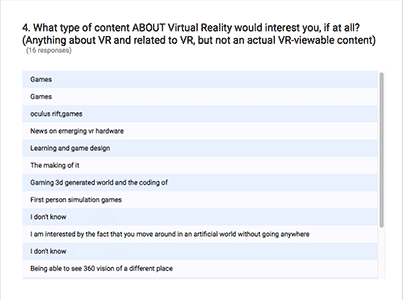
To know what type of content about VR TA would like to watch, I conducted a survey with 10 participants.
9 of 10 wanted to see the gameplays of different VR games/ experiences
8 of 10 mentioned they “watch gameplays as movies”
After the series of test and iterations the vlog was launched. It was decided to shoot in batches (6-8 episodes) in order to accumulate feedback and have an opportunity to improve. First 1.5 months, the episodes were posted twice a week to introduce people to the new channel. A roadmap made specifically for the vlog helped to stay focused on the goals and to keep the deadlines. The milestones are documented below.
a. MVPoC of vlog, covering the fun and best VR games for mobile.
Introduction to the vlog and Nina. Using minimal budget under $100
laptop, background paper, posters, light and stands, 2 umbrellas
duration – 3 weeks
gather first feedback
Below is the Channel Trailer (35 sec.) with some of the first episodes featuring several games.
b. Feedback analysis, adjustments according to the received insights (make longer gameplays, more info about the game itself, bugs, features, make better sound)
MVPoC had a positive outcome (85 subs in 2 mo, likes (approx 8-11 likes per video – high customer engagement, good ratio subs/ likes), comments, e-mails, 3 game studios pitching their games and collaboration proposals).
Next: add gear and inventory for the budget under $400
duration – 1 month
gather feedback
Some of the episodes are below.

c. Feedback analysis, adjustments according to the received insights (adjust sound, mention if button is required)
Gather more feedback from all channels (Youtube, Reddit, Facebook, Twitter, e-mails..)
Switch from posting twice a week to once a week
duration – 1.5 month
The episodes are below.
d. Ranking Improvement (analyze statistics and adjust)
Improve:
– titles
– descriptions
– tags (improve tags in all 3)
Get more clear in the niche (mobile VR games for Cardboard)
Received Feedback: add more talk/ opinions during the experience (voice during the game), a more thorough review, some more information about the developers, some technical specs.
Look for trends to plan posts, videos and other materials around these trends
Conduct survey, get feedback – change content based on the results;
Conduct a survey
Add gear for the budget of $1200-$1600 (camera + lens)
duration – 1.5 month
The most recent episodes are below.


Nina – VR Oxygen's brand voice. Many details were considered before confirming everything and shooting, including name, speach manner, topics covered, what should be in the shot etc.
Personality: Nina is vlogging, tweeting, facebooking, using other social media for communications on the brand’s behalf. Nina likes exploring new, based on her background she can speak about VR, she also works on VR and starts sharing the findings and tips. Basically, following the actual story and keeping everything transparent.
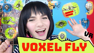
Nina appreciates everyone in the community and presents each game in a creative way (her surrounding is related to the game she is talking about), never saying negative about the game and its creators, and always encouraging to explore VR, reminding that all the games she presents are the best, each experience – in its individual way (it was mentioned in a Voxel Fly episode). All the games were thoroughly selected based on different criteria.
Nina is really excited for VR to succeed and to help more people to understand it right. Nina works towards being more similar to the audience at some characteristics but keeping individuality, working on iterations along the way, gathering feedback and adjusting.
Nina is bold, fun, likes to experiment. But she is also nice, friendly and humble, she likes helping and wants to make an impact.
Those of the character traits also capture the evolving nature of the company.
The words that describe VR Oxygen and Nina: essential, creative, experimental, helpful.
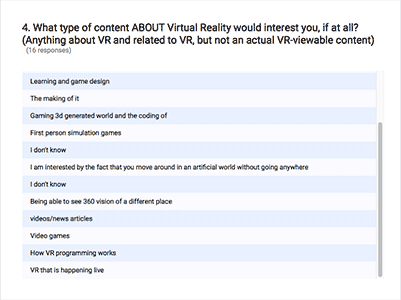
The new survey conducted in High Scool with TA unveiled more details and insights on how to improve the vlog for 16-18 y. o. age group. The main findings were about the type of content people were looking for, some of the new findings are below.
What type of content about Virtual Reality would interest you, if at all?
The main findings (in this direction): Learning VR, Games, live VR and 360° videos, news
Dispite the growing amount of proposals from game studios the vlog was “paused” (the content stays same with no iteration to maintain consistency) for the time to finalize research in High School and other participants from TA, iterate based on research and feedback, work on a new type of content targeting the new TA (13+) (educational); work on the new website for VR Oxygen, and continue working and experimenting on an actual VR product. The latest episodes are soon to be published. Please contact for details.
Findings: The most productive way to get feedback is to ask right in vlog – people are the most responsive and give feedback to Nina via e-mail. Next – on social media (Reddit, sometimes Twitter), as well people are very responsive. The Google Forms Surveys pinned in the comments, as well as cards and other in-vlog surveys (YouTube tool) are not successful at the moment.
The distance between iterations was usually 6-8 episodes, to gather feedback and check analytics.
1. Thumbnails were tested and replaced as well based on the analysis.
After uploading a variety of styles, the types of Thumbnails that get higher click through rates were discovered (those that look like a CTA button among other content, Thumbnails containing bright solid color with minimal details, geometrically clear, faces with strong emotions)
2. Tags and keywords research (Google, Google AdWords Keyword Tool).
3. Gradually increasing quality (content and video)
4. Tested different length of the videos (keeping the videos around 8-12 min long is ideal (or at least more than 5 min, less than 15).
5. Tested very short videos as well (1 min long)
6. Analytics analysis (who is watching what, when they watch etc.) and more tests and analysis was done.
7. Publishing time and day
The goal is to make content that’s interesting for TA which should be:
– informative (solves problem)
– entertaining
– positive; funny
– unique
Below is the vlog production process. It was iterated and changed slightly on the way due to software and equipment change.
After 2 mo. milestone, the YouTube channel started to convert some visitors to customers (checked via analytics – referral links)
Following on Twitter became more stable, the unfollowing rate decreased, following per day doubled (from 3-5 to 10-12 on average per day with 0-1 unfollower). Following is higher when posts are regular
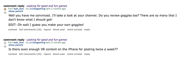
Reddit – upvotes and comments increased dramatically resulting in active communication and feedabck

IGN – likes, feedback and communication increased, new leads to views
Facebook – likes/share per mo increased slightly
YouTube – people became more engaged (more comments, likes, e-mails)
Building trust – month 2 results: positive comments and more engagement
Twitter and Facebook followers started sharing VR Oxygen’s content (some with high following that resulted in retweets and likes)
Proposals to review VR content increased (started at 80 subscribers, which was unexpected. The channgel got more subscribers after those types of reviews, even more content to review, more feedback, more mailing list subscribers, more sales – a visible performance increase compare to "before the vlog").
Collaboration proposals
The vlog links on the company website have a positive impact
Each iteration usually brings more engaged viewers, more proposals and increase in conversion. The work on the vlog is to be continued after a short break for research and new content developments.
VR Oxygen has customers and needs a website that would communicate the brand’s values clearly, show its philosophy and value proposition to different customer categories: casual mobile gamers, buyers, as well as newly gained customers that are involved in game or VR development.
I practiced various types of research to find the best solution for the found problems and needs. This research as well influenced vlog iterations. I utilized the following:
Guerrilla Research (analytics, heatmap);
Competitive analysis (product websites);
Surveys and user Interviews;
Observation (expos, University, schools)
Quantitive and Qualitative Research from Greenlight VR, Dubit Research “Kids and VR”, Order Dynamic Whitepaper and other available resouces that allowed to see analytics and metrics
To be a hub for everyone who wants to try VR or who is looking for good VR content. A place where people can easily find everything they need – a viewer and games, affordable VR. A seamless experience – get a viewer – get an experience, and while waiting – watch these games online. No need to waste time searching for VR content.
People ages 13-18, casual gamers, mobile gamers and their parents
Young adults (18-35) that are interested in new technology, casually and professionally
Educational organizations (Schools, Museums)
Needs to clearly express brand’s philosophy and value proposition.
The content that VR Oxygen produces changed much from the first time the website was launched, thus, the website needs an Evolutionary Redesign based on the new and prospective content and a newly discovered goals and needs of TA.
Website is too crowded with content and code, loads slowly.
Keep people on website longer to explore more content (convert), flow from one to another.
People abandon cart due to uncomfortable and confusing experience.
Create a comfortable, easy to undertand and use website experience for New users and increase: views on Youtube channel, conversion, subscriptions (+ sign up conversion rate – secondary)
Create appropriate content: imagery, texts, titles; write a clean code to load fast
Generate more leads from YouTube and social media
Create a mobile/ iPad/ desktop website, an easy to use and convenient cart with a minimum of required fields (better UX for cart)
To evaluate the current product – the manufactured viewers, to discover people pain points that were not seen earlier, and to get insights about the ways to improve, to test the current website, were conducted short interviews with 20 expo visitors, 10 more people were surveyed.
I came up with an idea to test the cart with New users: VR Oxygen had a Sale event during the Maker Faire expo where visitors could get a discount only if bought online by certain time meaning that most of the people had to buy it right at the event. It was a great opportunity to observe people using the website and cart in front of me, all the major issues became obvious (people asked questions).
VR Oxygen was invited to University to give a talk about Virtual Reality, it was a one more great opportunity to test the viewers, the website and cart with the TA, because several students started buying the viewers right in class and asked questions.
Observations showed:
How do people navigate the website (not all people scrolled, some did scroll because didn't notice how to buy)
How easily do people understand how to buy a viewer (cart has some UX issues, it's currently a standard template from the 3-rd party software)
What do people do or try to do after purchasing a product (looking for games)
People’s answers, reactions and expectation gave great insights about the possible improvements (What to play? Where can I get the games? Do you also make games? etc.)
To understand how people feel, I asked the following questions:
Do you like the look-and-feel? (The answers varied, but most participants did like the look)
Do you understand the product’s value proposition? (not everyone understood)
Google Analytics showed:
How do people move through the site
If behaviours vary between devices, locations or demographics (greately varies by day – weekday or holiday/ weekend)
The hitmap (ClickTale) showed that people don’t scroll and that they might be unsure where to click to buy the viewer.
Even though it was clear that the website needs redesign, the tests hepled to understand better:
That CTAs were not always effective
People didn't usually scroll
Insights into what people are aiming for (better cart, and access to good quality VR experiences)
User reasearch also helped to understand the vocabulary that people use and can understand, it will affect navigation and category labelling.
More problems found on the website when tested with another group of people at the University:
2/5 disliked the landing page
2/5 asked if there are reviews or any more information about the veiewer
3/5 couldn’t understand how to buy the cardboard
4/5 couldn’t understand what’s special with VR Oxygen viewers
As usual, all the data was documented to evaluate in the future
Based on the research results the following assumptions were made:
Creating a landing page with clearly stated values and options, choosing the right content relative to TA and company values will help to keep people on the website longer and to convert them to customers, because it would build trust and authority, engage and help in finding useful content.
The right visual content (concise, sharp, visually rich, on topic, use video) will help to engage with TA.
Adding reviews will help to gain more trust (ask the real VR Oxygen Cardboard people to write testimonials).
Add the product and company story, so people will form the right impression and keep being engaged.
Creating a custom cart with UX developed for customer needs will result in higher number of sales and lead to increase of vlog views.
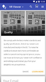
Adding the product manufacturing details (lenses details and photos), production process pictures – demonstrating transparency – will help to build trust as well as the information will educate customers on the product in general (how to select a good Cardboard VR viewer).
Making CTA more prominent and locating it in the stronger click through place (following Gutenberg diagram if on desktop, centered - for mobile) will result in higher conversions and increase the time spent on the website.
Creating the website in the form of a Progressive Web App (PWA) will be convenient for users because it feels native and due to the development specifics, is fast to load and convenient to use but despite native apps it doesn't require any installs or any storage space – it is still a website.
Show the quality, educate people on the product, be transparent about all processes (show lenses comparison, tell a story about how they are manufactured etc.)
Give people good quality, selected content, create a flow that supports vlog engagement and game downloads.
Create a comfortable checkout experience.
How might we...
Improve website appearance and functionality for people and business success rates (conversion, subscribers, engagement, feedback, higher quality game proposals).
Increase subscribers count and views, shares (User marketing), customer engagement.
Collaborate with schools, colleges, Universities, museums and other educational organizations.
Become a hub for all the great VR content in 1 place.
Based on the research I developed several personas showing people’s behaviors, needs, goals and motivations, problems and mental models. It was critical to establish the right TA in order to create the right customer experience. As well, content creation (now – vlog) heavily relies on Personas.
The research also included materials from:
Greenlight VR research
Dubit Research “Kids and VR” Qualitative Research
Order Dynamic Whitepaper and other resources
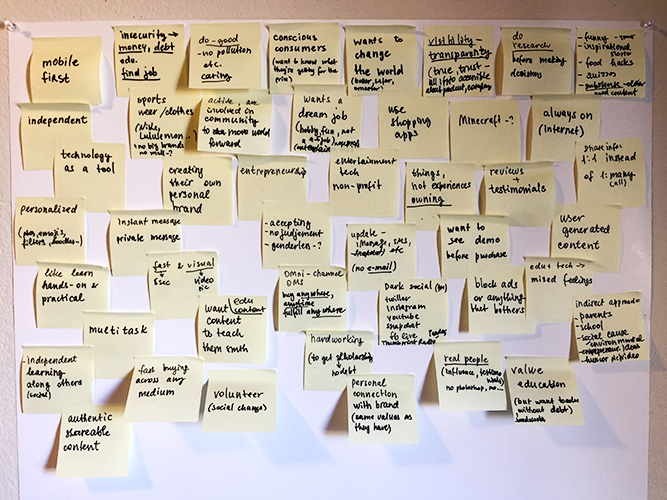
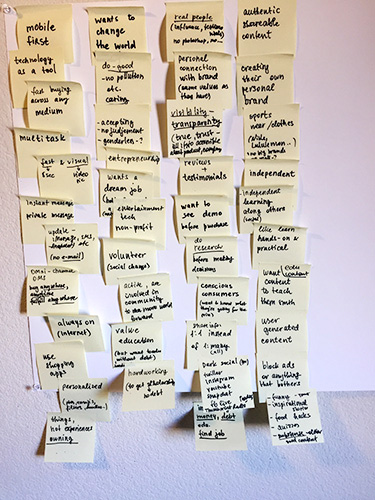
When analyzing my research and interviews, I decided to group all the information by commonalities, creating an affinity maps.
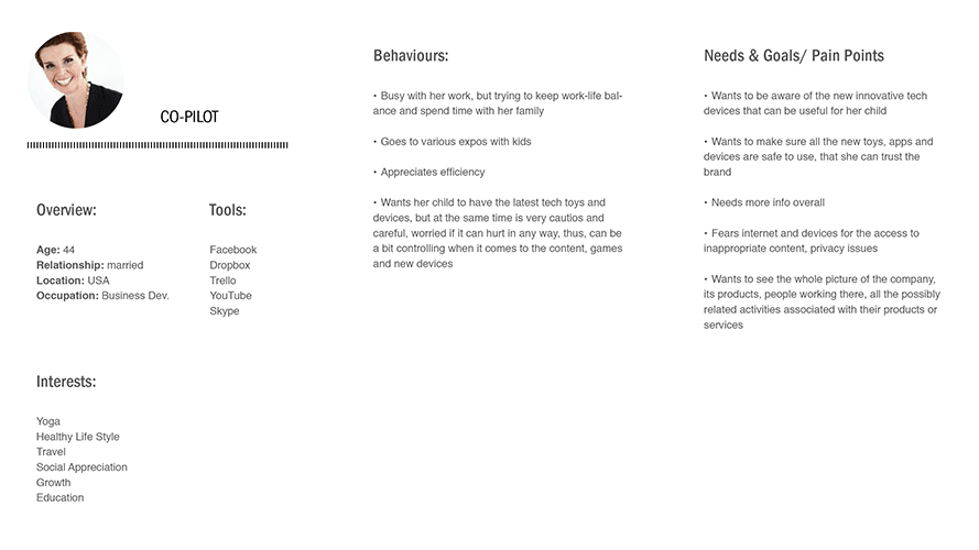
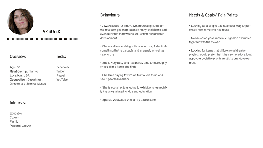
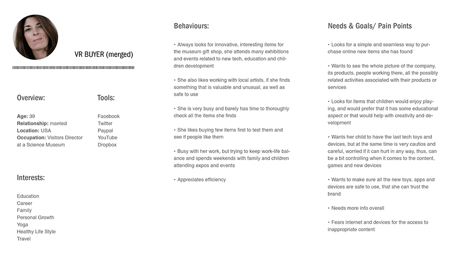
All the discoveries were sorted out into 4 Personas:
World Changer, Co-Pilot, VR Buyer and VR Discoverer. An affinity mapping process for the World Changer Persona is on the picture below:
Later, after moving to the other social media as a main sharing source for video blog, one more Persona was discovered – VR Enthusiast:
After more research and interviews, it became clear that Co-Pilot and VR Buyer have more similarities and can be merged into one Persona:
When VR Oxygen started getting proposals from game studios and finding similarities, one more Persona was formed – Game Studio:
As a result, the current Personas are: World Changer, VR Buyer, VR Discoverer, VR Enthusiast, Game Studio. Assuming that VR Discoverer and VR Enthusiast may merge in the future, but for now decided to keep them separatly due to various differences in behavior. Personas research and adjustments to be continued.
To better understand the mental models of the people, to discover how people understand and conceptualize the information and where they expect to find it, I run a card sorting.
1. Website structure and navigation, content structure (expos, in-person, open card sort). 15 participant took part at the workshop, where they sorted all the content of the website into groups, then they titled these groups.
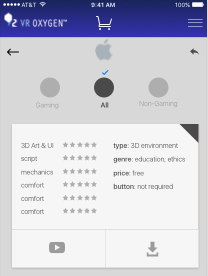
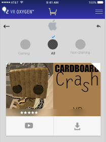
2. Similar task was done to categorize game types and genres – with 10 people via Optimal Workshop and 5 people during an in-person moderated card sort.
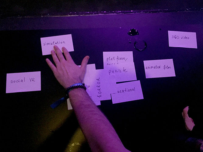
The list of genres and types was created beforehand after reasearching the existing VR content distribution platforms, as well as brainstorming based on the customer reaserch and discovered needs. Type (e.g., 360° video, animated film...), category (e.g., education, travel...), genre (e.g., action, simulation...). During the session the participnts could remove some of the cards. Most of the people guessed that categories such as travel, education..., are common throughout the variety of diferent types and genres, and sorted types and genres.
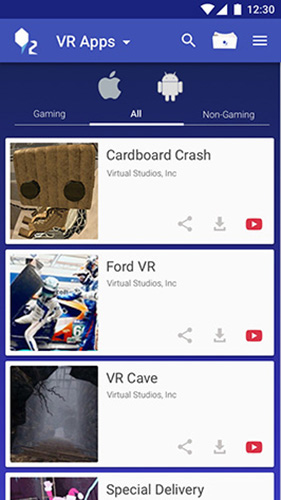
Based on the results – the way people sorted the cards, the follwoing 3 categories were created for games/ experiences section: Gaming, Non-Gaming and All.
Next, I decided to get more precise results in defining the games’ genres and categories, but it’s much more complicated to accomplish because to title the gameplay requires watching a gameplay or reading about it, so it was decided to offer a reward for this type of test. Participants must understand most of the content (– to be conducted). It’s planned to keep testing and to do more card sorting later on the way to validate the labelling for particular games (that are unlabelled by the developer).
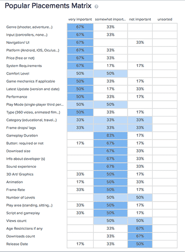
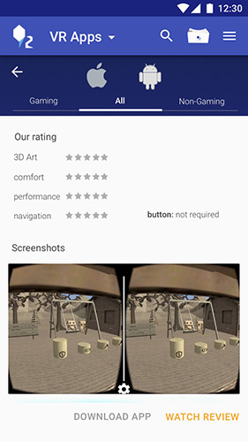
3. Next, I made a study to uncover the details the people would like to know when they are looking for the game. To establish which information people consider to be the most important about all VR experiences, I created cards with different information such as “button: required or not”, “size”, “gameplay duration”, “frame rate”, “3D art” etc., and had participants rank them according to how important they consider them to be. People sorted them into the following groups (closed card sorting, conducted online via Optimal Workshop):
– very important
– somewhat important
– not important
The game genres card sorting excersice helped to understand what information to include into each game description, such as: genre (shooter, adventure...), input (button, none), navigation/ UI, platform (Android, iOS), price, system requirements.
Card sorting showed that most New users grouped games differently from the Experienced users due to different language. Similar to the previous tasks, this card sorting is to be contunued and iterated.
Based on Scenarios I created a user flow for each Persona. After several iterations and shaffling the user flows were developed, they were then overlapped to see the full picture of interactions.
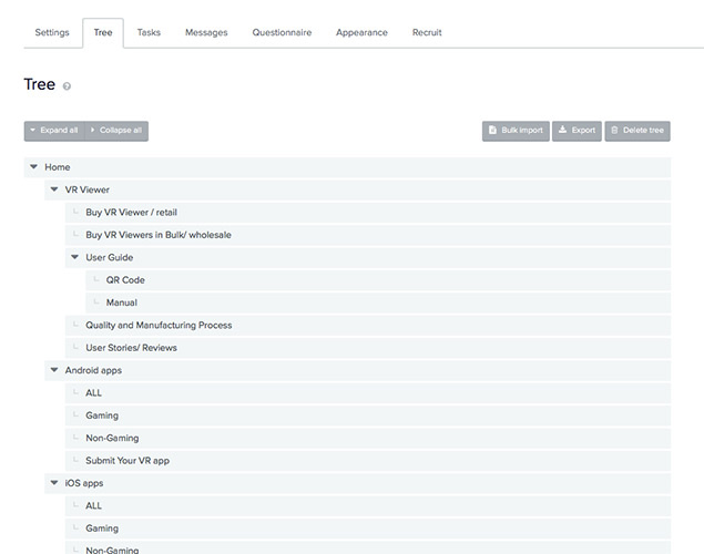
Tree Testing (IA)
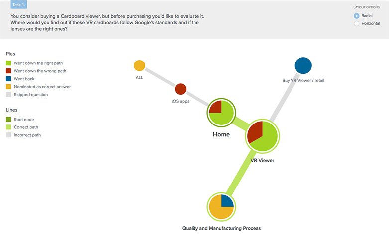
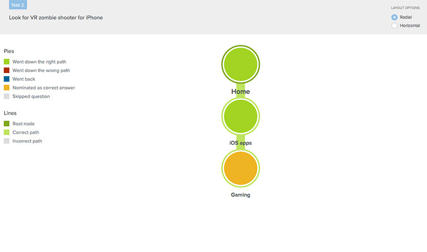
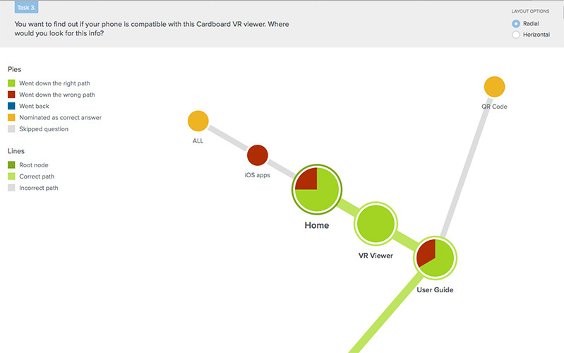
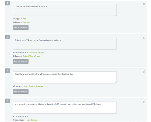
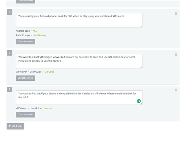
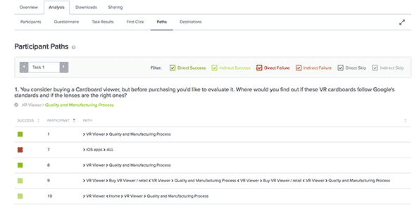
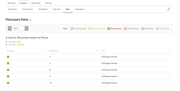
To test the structure of the website and to understand if the content is grouped logically to people I conducted Tree Testing. After creating the website navigation model the tasks for potential customers were written, people would have to complete them within the designed navigation.
This type of excersise was good to test scenarios and to see if people can find the requested information within the designed structure.
The tree was tested with 10 people from TA via Optimal Workshop. I tested 3 tasks per session and had 3 rounds of studies with each customer to test all 9 tasks (remote study).
The analysis of the test was concentrated on the following questions:
If people were able to find the content: how many people got it right, how many people got it wrong
How long did it take people to complete the task
The paths people took, and whether or not they had to click back up the tree
Where did the people expect the content to be located
Where did the people go first
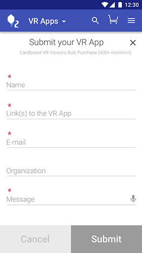
In order to simplify the collaboration with a developer and to create a document containing a full set of interactions, I started developing the Use Cases describing HOW people will perform tasks on the website. An example is below:
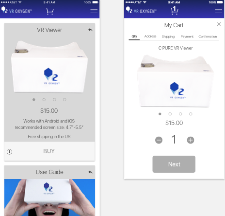
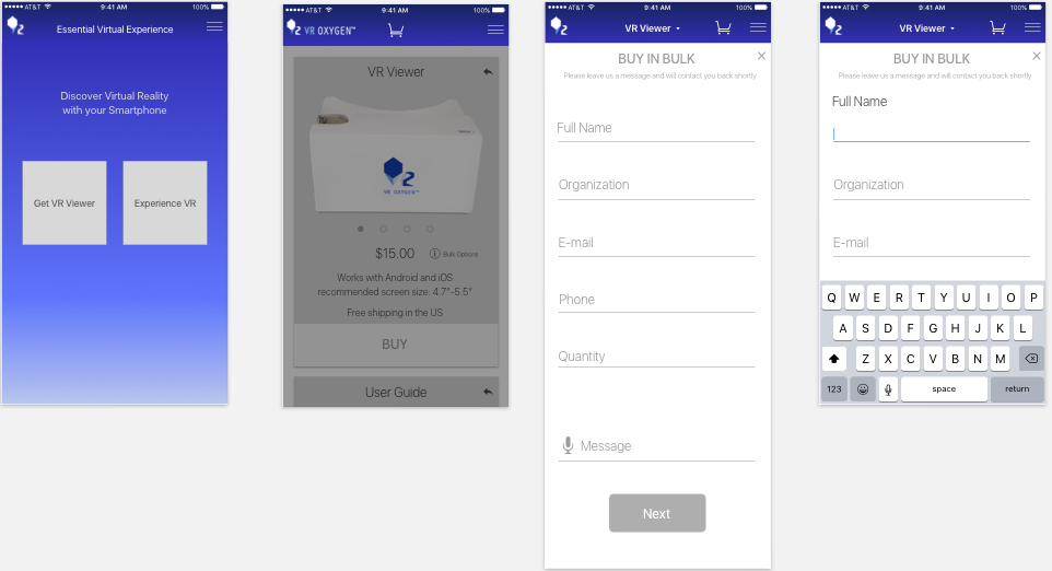
Use case 1. Buying Cardboard VR Viewer (for Bitcoins)
Customer – World Changer (Alex)
Preconditions: Going home from school.
Trigger: Alex received a message with the link to VR viewer.
Basic Flow:
1. Customer enters the VR Oxygen website
2. iPhone loads the landing page
3. Customer chooses VR Viewer section and proceeds to the page
4. iPhone delivers the VR Viewer page
5. On the page customer checks the photos of the viewer by swiping left or by clicking on the dots below
6. Customer clicks the BUY button and proceeds to the cart, iPhone delivers the Cart page
7. Customer chooses the quantity they want to buy by tapping on + or -, iPhone changes the quantyty with every tap
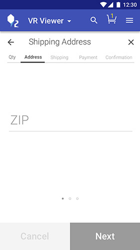
8. Customer clicks on the Next button and if there are no errors, proceeds to the Shipping address screen. iPhone delivers the Shipping Address screen
9. Customer types in their desired shipping address, when done with the shipping address customer clicks next and if there are no errors with this screen customer proceeds to the Shipping Method
OR If there are errors – incorrectly entered zip – gets error message – updates info – proceeds
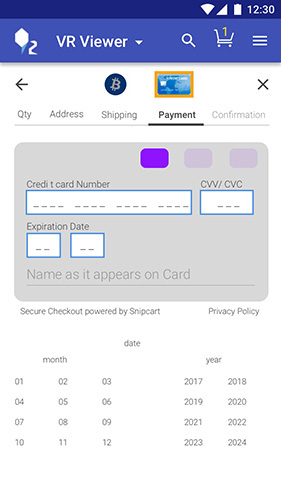
10. Customer chooses to pay using bitcoins and proceeds further by clicking the Next button
11. (depending on the merchant an method - wallet, QR scan or input)
12. Customer proceeds to confirm everything, iPhone delivers the Confirmation screen
13. Customer can check the item (cardboard VR Viewer), quantity, shipping address, payment method, tax and the total amount. Everything is correct and customer pushes “Place Order” button. Payment is withdrawn (process started), e-mail to the customer is being sent to the address they provided
14. iPhone delivers Thank you screen telling that a confrmation e-mail has been sent to an e-mail Alex has provided an offers to explore VR games and experience
Ideation, Creation, Design
The design process was organized based on Design Thinking techniques and Google Venture Design Sprint excersises. Brainstorming and mind mapping, 8 ideas in 5 min, 1 big idea in 5 min, 1 storyboard in 5 min and in 20 min, How might we... techniques were used to generate as many ideas as possible. Each excercise helped to find new paths to dicover.
Understand and Define
First, I decided one more time to go through the research and pinpoint the insights about the type of information to use, both, content and visual (derived from the research stage) such as: bursts of info, short and consice content, video, pictures as instructions, less text everywhere, simplify, get or watch an experience in 3 clicks, get cardboard in 2-3 clicks (proceed to buy in 1 click) etc. I underlined the main customer needs and pains and aligned them with VR Oxygen goals.
Diverge and Decide
The main journey was drafted based on the insights from previous stage. Below are some of the excercises I practiced:
Next, all the ideas were reviewed, analyzed and 2 ideas were selected to test: "Split screen idea" and "video on screen". Being on a budget required me to think about the customer value versus techical difficulty – what is really worth creating that people really need. I always kept it in mind and made decisions balancing customer needs, business goals and available budget.
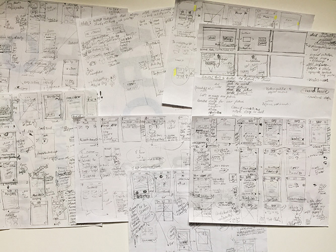
Prototype, Mockups, Prototype
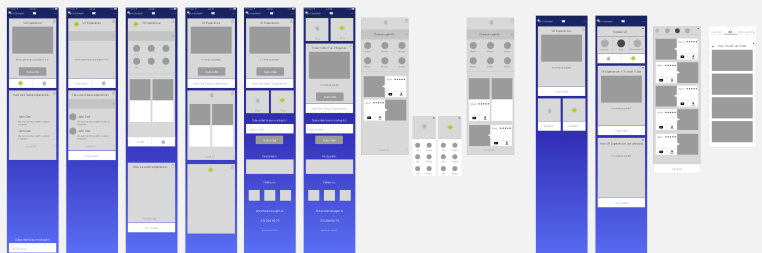
The first prototypes were low fidelity paper sketches, the next one was made in inVision based on the wireframes I drafted in Sketch. I tested the screens and flow, navigation and the amount of content.
After testing the paper and rough inVision prototype I started refining the designs, determining what content should be available on each page, working on the layout and interactions for each page type more precisely.
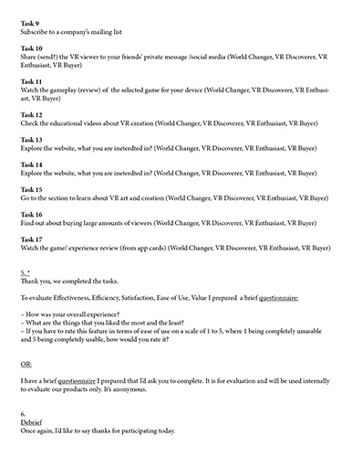
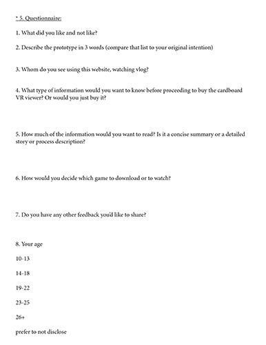
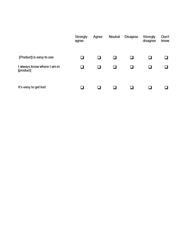
To evaluate the design and content I conducted usability studies, some tests are currently in progress.
Usability Studies with TA based on Personas:
2 rounds of studies with 5 participants per round. A phase of the product development and goals were considered when making a choice among research methodologies.
Methods:
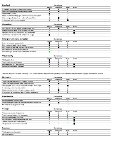
Heuristic Evaluation (Based on J. Nielsen Heuristics List and ISO 9241 Ergonomics of HCI, Part 110: Dialogue principles)
Visual Affordance Testing to make sure CTA and other elements (menu, cards) are recognized
Walktrough and Behavioral test – interviews
Tasks completion/ Think aloud test (based on scenarios) – interviews (done; more tests in progress)
After launch:
A/B Test the buttons on the landing page to see which buttons do people push more often to reorganize the layout if needed; Optimizeley
Contunue tracking the custom click events (Google Analytics). Track game downloads, video plays, VR Design Materials, may be use for conversion tracking.
To Improve:
Reviews – people would like to have more reviews, asked where are these reviews from (marketplace)
(4 of 5 people)
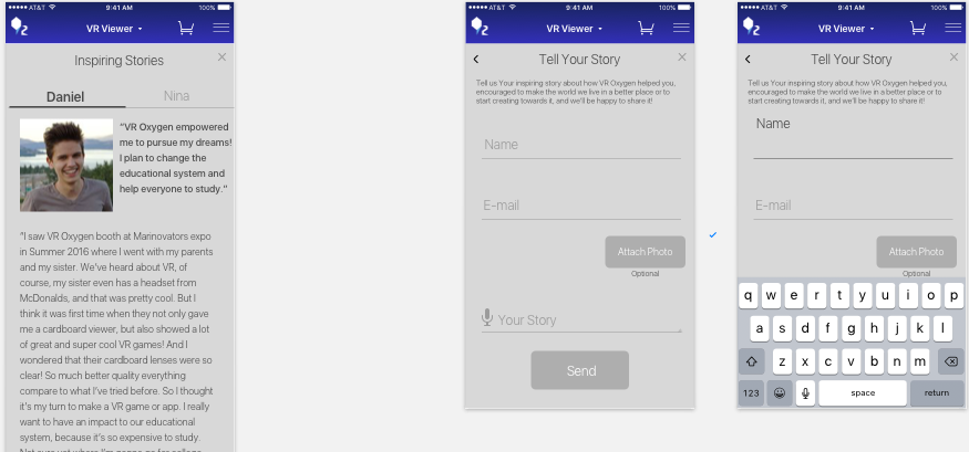
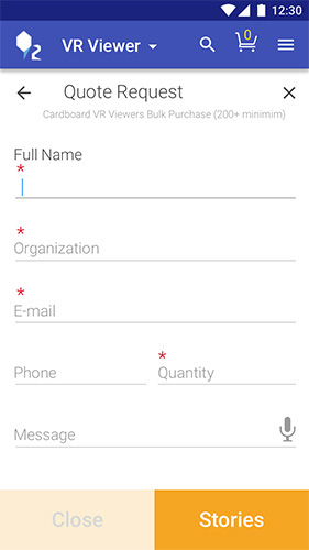
Suggested solution: replace reviews by stories from real customers and let people share their stories right on the website (not instantly since it would require permanent website moderation. People will be able to submit their stories and get published after the stories are reviewed).
People wanted to go to VR experience from VR viewer screens easily and fast (4 of 5 people)
Suggested solution: dropdown VR experience/ VR viewer
Some people thought the VR experience is an experience made by VR Oxygen. (2 of 5 people) Even though they liked the possibility to have a list of selected VR experiences, should make it clear that there are selected VR Experiences from various game companies or solo developers.
Suggested solution: provide a short description, list the game company.
People asked what type of VR it is (e.g., mobile or Oculus) (2 of 5 people)
Suggested solution: make clear that it’s mobile VR, provide description/ title.
Merge Product story, manufacturing details in one story to make the information more compact.
Tested Positively:
People had no problem finding CTA on the landing page (5 of 5 people)
People could find how to buy a viewer with no problems (5 of 5 people)
People have found games and the vlog game review videos very inetersting, engaging and unusual as “pice of art” (as some said). They also enjoyed browsing through the experience section and checking out the thumbnails (5 of 5 people)
People could successfully finish the given tasks (5 of 5 people)
People knew what to expect from the VR Experience section (either buy or watch an experience) (5 of 5 people)
People always knew where they were (5 of 5 people)
People could understand that they can buy a VR viewer on the website as well as get or watch VR experiences (5 of 5 people)
People could understand how many steps it would take to buy a viewer (cart) (how many steps to go, how many steps are done) (5 of 5 people).
People could understand they can share the cards (and they liked it!) (5 of 5 people)
People liked the experience overall and mentioned that they’ve tried to search for something on different VR companys website and the website was inconvenient to use, people liked that VR Oxygen website is made specifically for the phone (2 of 5 people mentioned exactly that)

To Improve:
Make A and iOS current state more prominent
Call to Action on cards was clear, but people tend to click on the whole card on Stories (3 of 5 people)
Suggested solution: change the color of the white card, make the whole card clickable. Modify the button so it’s clear it contains more info to read.
Tested Positively:
VR Oxygen logo was interpreted by people as a home button (5 of 5 people)
Purchasing procedure is clear and simple, people had no problem with it (5 of 5)
Customers could cancel an order easily (5 of 5)
For this stage of prototyping I switched to Origami Studio to create more detailed interactions. The following stage will be preparing the final prototype to test one more time with TA and to use it for development.
While designing and testing the new website, the new research and vlog series were started. After the analysis it was clear that the new series had a positive impact and people are interested in reading/ watching more of such materials. Thus, it was decided to add a new category to the website: VR Design Materials. It lead to the landing page restructuring.
More tests were conducted to reveal the hidden issues. The following changes were made:
The search icon was removed and the cart was placed in the App section as well making the navbar identical to the other sections for consistency.
All the sections are now located on the navbar to make all the content accessible from any location on the website.
Changed the color of Android and Apple logos to white, which as well promotes consistency (all icons are white now).
The navbar was removed from the landing page to avoid the possible distraction and concentrate on the buttons and CTA.
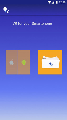
The Viewer/ Apps are now replaced with a viewer picture and Android/ iOS logos. It as well helps with consistency – all sections are represented by icons, and makes navbar less crowded. Icons as well act as a more natural visual cue for VR Oxygen's TA than text (validated by research. See Research section for details).
Changed the stories card to follow the same card template as other cards – with the picture on top and text on the overlay above the photo, for consistency. As well, the photo was changed representing now 3 people instead of one. It's intended to promote unity, friendship and equality. And looks more as a community rather than just cold reviews.
Eliminated "back to home" button replacing it with the new "VR Design Materials section", because there is no more need to go to home to proceed to the other section.
The Buttons on the landing page are located based on the Thumb Zone which provides the natural flow and can impact where people click first. (It helps the dexterity when using 1 hand). I created 2 versions to test: with the Viewer button in the middle and on the bottom. As well, the buttons are now much larger which increases the discoverability and simplifies the expected click action.
Based on the Thumb Zone I as well flipped the Android and Apple buttons, making Android easier to reach.
The button priorities are selected based on the VR Oxygen business goals the most used device (Android) which was discovered via analytics.
Priority #1: VR Viewer,
Priority #2: Android section that has a FAB to video blog which, in its turn, has leads back to the website and cardboard VR Viewer. So it's looped.
The Cardboard Viewer button as well separates the entertainment (bottom buttons) and design/ learn content (top buttons).
Locating all the sections' buttona on the landing page helped to avoid the confusion when people guessed what type of VR it is about. Having Android and Apple logos, as well as a cardboard viewer picture on the landing page provides an immediate explanation that it's mobile VR.
The "Feedback" and "Subscribe to the Mailing list" have a new design and are more spaced out to make them more prominent and separate from the main content.
Decided to keep a share button on the main card as an icon – on the left from BUY CTA (Cardboard section). Having "share" as text distracted people from the main action and they were more slow on proceeding to buy, spending time (even though a short amount) reading the button. Icons have much better readability. This way, the main accent is on the BUY word, defined by it's location and style difference – a short text button that catches the attention.
The tab design of the Game/Experience section (Android/ iOS) is flexible if the new research shows that the labelling should be changed and more than 3 labels are needed. In this case the tab sections will be crollable.
The new prototype is planned to be tested in July at the expo where VR Oxygen will hold a workshop. Among several things to be tested are:
The landing page and CTA buttons, check where people would click first and why.
Check the buttons' position and colors – A/B test 2 different landing pages.
Check if people are confused by the "VR Design Materials" section location – on the top left on the navbar. It previously led to home page, as well as natuarally the "back to home" button is located on this place.
Check if people understand what the red Floating Action Button is (to watch the review on YouTube).
Check affordances: if the CTA button style on the screens and cards (full device width, different from the native Material Design style) is intuitive for people, if they understand immediately that it is a button.
Test if the Info line with the Bulk Option pop-up is perceieved as clickable.
Test if the social buttons on the Android Apps cards are comfortable to reach. Consider flipping them for better thumb reach.
Test navigation tab location (menu, cart, iOS....) and determine if it's better to move it to the bottom or keep on top (based on affordances) – understand how frequently it is supposed to be clicked.
Below are some of the screens and some viewes of the prototype (more detailed interactions to be added after this test is completed). The next stage before the development will be completing the prototype by adding detailed interactions such as Ripple and card transitions to each element accordingly, and iterate based on the test.
My choice to create a Progressive Web App (PWA) was as well not random. Besides my hypothesis and some interviews with people concerning their app usage, I made a reasearch about PWA and companies that switched to PWA types of websites. The results were very positive, for example: multiple times increase in user engagement, significant increase in time spent on the websites, several times less data usage, visibly greater conversion rates etc.
Among the other useful features of PWA are: a possibility to have an icon on the home screen, push notifications, not much internet connection needed (up to zero) thanks to cached and dynamic info and some more. The website can be shared through a URL which is as well extremely convenient knowing that the TA emphasizes privacy, speed and user experience, counting it all as something natural to have. In terms of the software, iOS has less support than Android, but there can be solutions made, so it won't be a problem to successfully implement such type of website. I made several variations of PWA with minor changes. One of them can be seen below.
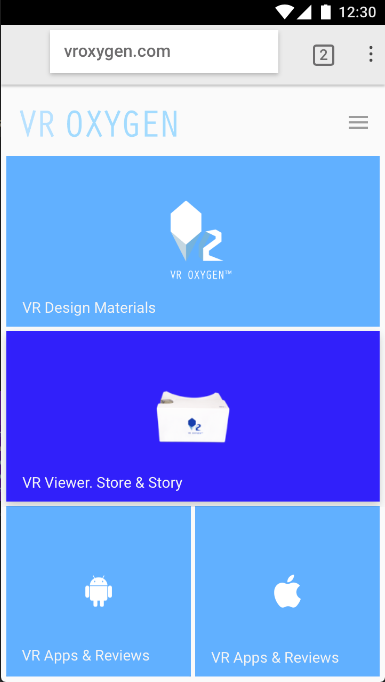
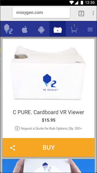
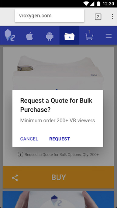
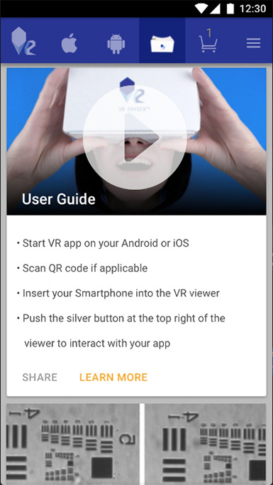
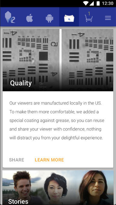
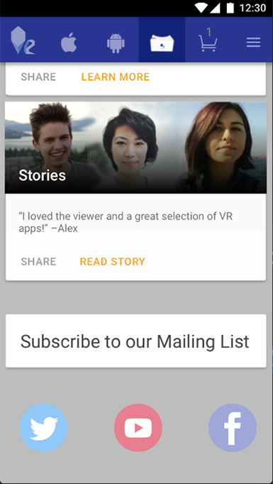
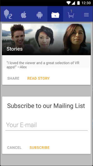
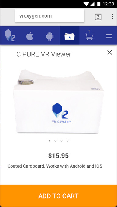
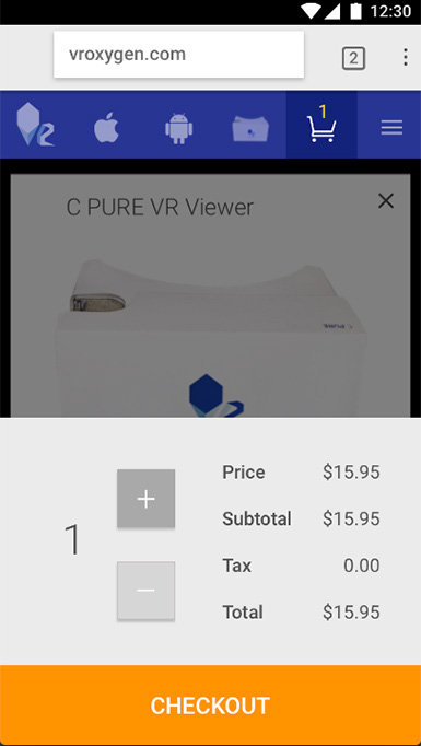
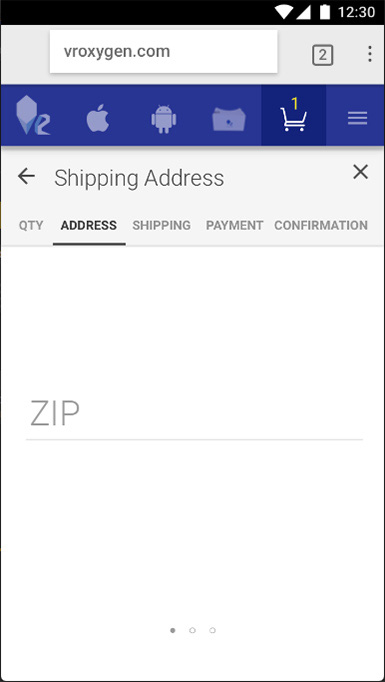
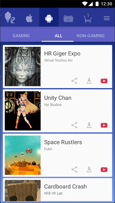
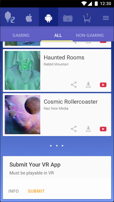
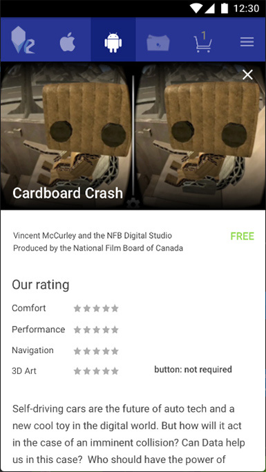
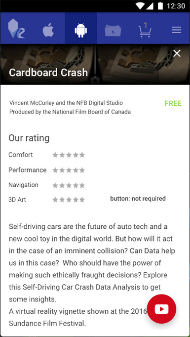
The viewers and website were validated with the University students, it was during the early stage of website design, the results confirmed the TA and the main ideas such as offering a VR experience together with the viewer (vlog + on the website), offer bitcoin payment. I watched students' interactions with the prototype and took notes. Among the positive signs were:
Some students have bought viewers right after the tests and started using the website immediately (the current version), some as well subscribed to YouTube.
VR Oxygen has real users of both, a viewer and a vlog + some of the people signed up to mailing list as well and are expecting a new product (an actual VR experience or tool) from VR Oxygen, and are communicating actively.
The other success signs are:
People (subscribers) started retweeting and showing the viewer to others more actively – marketing for VR Oxygen.
VR Oxygen channel was referred by several VR game studios to the other studios.
The latest video dedictaed to VR Heurostics gained new users and views a bit faster than previous videos, as well as received positive comments and retweets. This new direction will be continued.
Currently, the vlog is not published weekly due to the VR design and development, but it's active and will upload new content on a regular, less frequent basis. Please, contact if you'd like to know more.
To Do: continue gathering feedback, conducting surveys (every 2-3 months via vlog) and interviews (in-person interviews); test and finish designs for tablet and desktop, replace the "How to Use" photo with a "hero shot" with the composition following the direction of the CTA (desktop version).
Create assets and a blueprint for the development, create a final prototype with detailed interactions such as touch ripples and Material Design transitions for cards (curved trajectory, card zoom, notification pop-up etc.). Below is an example of the touch ripple for buttons.
The current website can be seen here: vroxygen.com
Some of the performans indicators that were meaningful to watch. Combined metrics:
Sales revenue. After the start of the video blog there were more sales than before, leads are he visitors came from the referral links – video blog had a positive influence to sales and company authority (the expenses assosiated with the vlog and the amount of time spent – all was considered when measuring the effectiveness).
Cost of customer acquisition.
Some conclusions were made after trying the Facebook ads. For now, it's decided to not use any of the ads.
Work productivity.
When checked the accumulated statistics over time it’s obvious that the overall outcome of the vlog and social media activities was positive.
Product performance (manufacturer quality control).
As it was established earlier, each batch is now carefully checked and all the documents are prepared in advance with necessary details
Units per transaction.
It was an interesting finding that more than 1/3 of people bought 2 viewers per purchase.
* The work is in progress. More hypotheses are to be tested and validated.
Product Design; Brand Strategy; Design Sprint; Product Management; IxD/ UX; Visual Design/ UI/Illustration/ 3D; VR storyboarding, VR prototyping, VR Design; Animation; Motion graphics; Sound Recording/ Editing; Video Recording/ Editing; Usability Studies; vendor research, vetting and communication; manufacturing set up; manufacturing management and communication; legal communications and contract writing/ assurance, Usability Tests documents preparation and other; outsourcing; Web Analytics and YouTube Tools; Financial Planning; Crowdfunding campaign research, preparation and execution.
© 2018 Olga V. Ivanova