
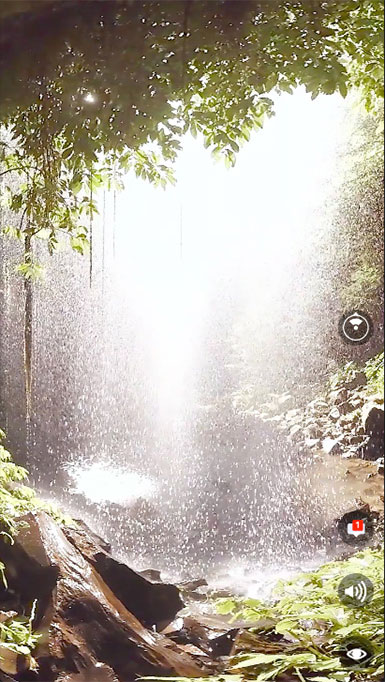
Mobile 360 video. 360 video credit: Mettle 360/ VR Master Series. Eric Fassbender, Atmosphaeres, Crystal Shower Falls
It was an experiment to find out if people are willing to scroll and be engaged with 360 video, if features like leaving notes and comments inside of the video would interest people. It also helped me to explore the ways of placing UI elements inside of 360 video and keep it discoverable.
I saw the importance to know more about 360 videos as a connecting unit between standard videos/ photos and VR. It can help people to get used to the idea of 360 and be a transitional point to an actual virtual reality. For my study I used an example template by Facebook 360 for Origami Studio and some free videos from Mettle 360/ VR Master Series.
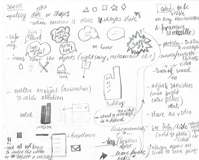
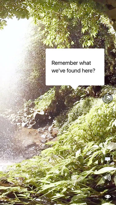
I had several ideas on how to make people engage with 360 videos. One of my assumptions was that people would love to leave messages to their friends right on 360 videos. It could be either fun notes, an invitation or a memorable place that people want to remind of – there could be various use cases (sharing a video with a joke; with some information about the location; suggestion to visit, sharing memories between people who are far away etc.), some of my brainstorming and mind mapping sketches can be seen below.
My hypothesis was based on the earlier research I made which included Facebook and Snapchat features. It was clear that people like making notes, draw or write something on the photos. And I decided to prototype and test some of my solutions. It is intended to be used within Facebook messaging or feed but could also be used in other messaging or social app. Described below is one of my ideas of possible user engagement with 360 videos.
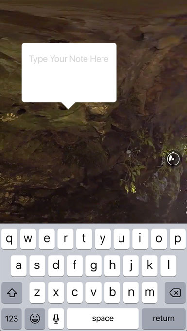
Other hypotheses I made:
People should be able to turn the sound off to make the 360 video more comfortable if the sound is too loud or unpleasant. This hypothesis was made based on my observations.
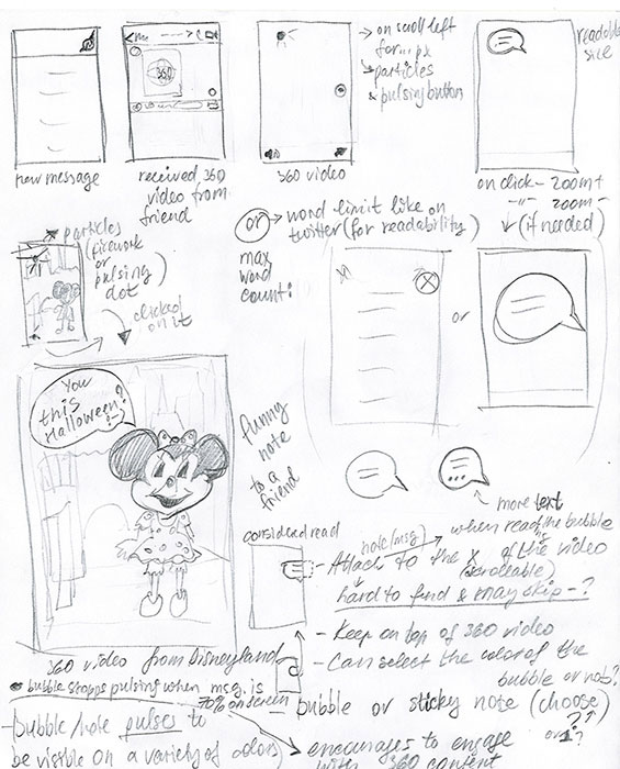
The message should have a limited number of characters (55) to keep the messages short and readable. It became prominent after some testing with different lengths and sizes of notes.
Placing the icons that are related to 360 video right above the video (sound control, bubble – message indicator) will help to clarify their belongig to 360 video, be perceived as a local navigation, not global. To avoid the arised confusion it was necessary to clarify the navigation placement.
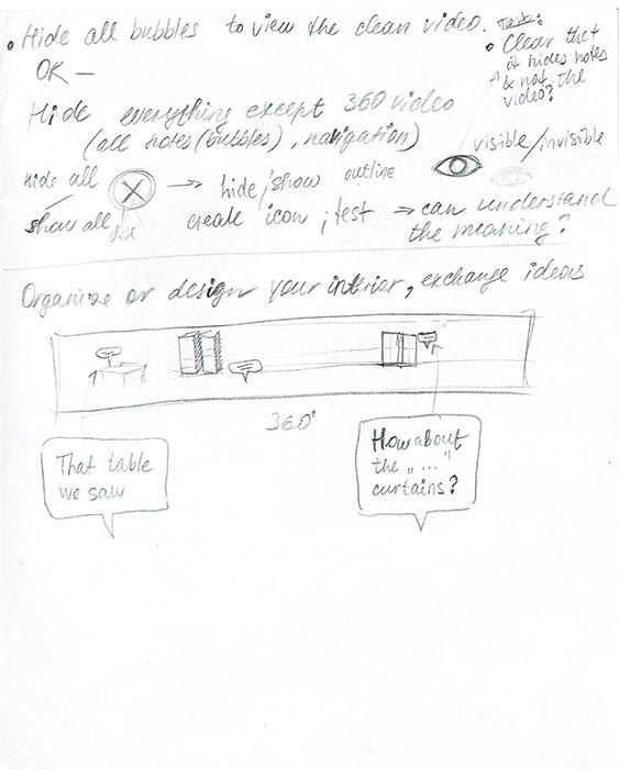
There should be a possibility to hide all messages inside of 360 video in case the user wants to scroll and view the clean video without any distractions (specifically, if video has several notes, or the note covers something the user wants to see). This statement was made based on my personal impressions and needs to be clarified further to be confirmed or refuted.
Considering to make the messages disappear after certain time if they were viewed. This hypothesis was made based on the Snapchat and Instagram disappearing photos and messages.
When I did some tests showing 360 videos to 4 people and asking to check the video, I saw that people not always scroll, so an indication of the message inside the video was necessary.
As a solution I decided to place the message icon with notifications (the white bubble) on top of 360 video in the botton navigation bar. The bubble differs from Facebook messaging icons to differentiate the global messaging and local messaging inside of 360 content. My hypothesis is – an easily discoverable message icon with notifications should encourage people to engage with the video and scroll to read the note. By clicking on the message notification icon it's easy to discover that there can be messages inside of the video.
As a first solution, I made the bubble pulsing to indicate that there is a note on 360 video, but later replaced it with the solid white bubble since after testing the puls it was clear that it's less notable on top of the playing 360 video rather than a static image.
The message icon in the navigation is anchored to an actual message (bubble) inside of the video: on tap on the message navigation the video automatically scrolls to the message. When the message enters the screen view, the notification disappears indicating that the note was read.
The message can as well be discovered on manual scroll by users.
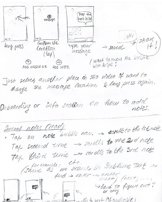
After the message is read the nav bubble stays in the navigation bar to make it easy to access this message again next time by tapping on the message navigation. If there are several messages inside of 360 video, every next tap on the message navigation will send the user to the next note, one after another.
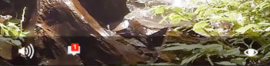
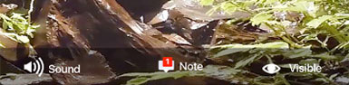
One navigation icon is sound, another is message, the third navigation icon is an eye indicating a visible or hidden state. Clicking on the eye will hide/ show all the messages inside of 360 video.
All the other navigation such as "share", "comment" etc. is left outside of 360 video – on the overlay that can be accessed on tap – as it's shown in the Origami 360 video example by Facebook.
At first, I added text labels to the navigation icons thinking it might help with discoverability, but when tested it on the device with different videos, the text labels were hard to read on the light or white constantly changing background, even with the black opacity overlay underneath it looked messy and created confusion. Thus, I decided to remove the text labels relying on the fact that most people are familiar with the icons and would recognize sounds and message. An eye icon needs to be tested more to see what the majority of people associate with this icon.
Then I tested the icons against several different video and photo backgrounds with and without text labels, the discoverability without the labels was better, there was no need in trying to read the labels. It is important to consider the motley type of background, because the video usually contains a variety of very different or opposite colors, so I worked on the icons and their positioning to make sure the navigation is recognized and eay to find on a background of any mix of color.


Next, I moved the icons to the right and positioned them vertically under the compass so all the icons were aligned. Having small icons located in different places of the moving video screen (compass – in the right center, navigation on the bottom) prevents them from being discovered immediately.
The new location provided better recognition and clarified that the icons belong to 360 video (are local) and not to the in-app messaging (global messaging). As well, the navigation icons are more visible and easier to find because they are aligned and grouped which is easier for people to perceive. The reaction of participants whom I asked to navigate was immediate.
One of the thoughts was to make a floating action button (FAB) such as in material design that contains all 3 buttons, it would open/ close on tap. The FAB tap area is separated from the video tap area that opens an overlay with global navigation.
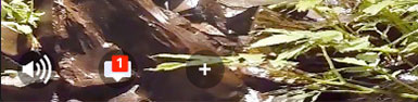
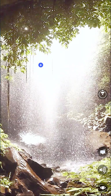
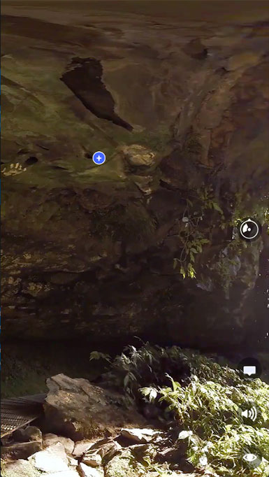
To add a note: Long press anywhere on the video where it's desired to locate the bubble-note will call a plus sign to confirm the location, tap on the plus sign to confirm. If you want to add a note to another location – just tap on the other place of the video (the unconfirmed plus sign will disappear in 2 seconds). If confirmed, a bubble pops up form the plus sign, next – type a message (55 signs max.). Push "return" on the phone keyboard. Done.
To read the note: click on the message notification for the message to be scrolled into the screen or just keep scrolling until the message is discovered.
I validated that turning the sound off is useful: some people immediately turned off the sound when noticed the icon, especially often it happened if the sound was intensive.
The idea with notes on 360 videos requires more tests and iterations to see if it's fun for people to write and place a note inside of the video. As planned:
Test the hide/ show button affordance, clarify if it should only hide messages inside of 360 video or hide all the navigation as well (similar to FAB).
Test if the users expect the bubble to pop-up and grow from the middle of the plus sign as it is right now, or if they expect the main content part of the bubble to be located in the selected position (plus sign).
Find out how to better present the onboarding tutorial "How to add a note to 360 video".
Disclaimer: This 360 experiement had a learning purpose, the featured video (credit: Eric Fassbender, Atmosphaeres, Crystal Shower Falls) came with "360 video post-production in After Effects and Premiere Pro, using SkyBox Suite" free course, along with other 360 videos, and was only used for educational purposes. I tried After Effects, Premier and Origami for prototyping, and settled on Origami and After Effects to work on 360 videos. I used the featured video in my Origami prototype because it didn't have any commercial purpose and was only utilized to experiment with navigation and interactions. I was fascinated by its composition and mood, and found it being the best example of varying background that's challenging to work with in terms of navigation.
Product Design; IxD/ UX; Visual Design/ UI; VR storyboarding, VR prototyping, VR Design; Usability Studies/ User Testing.
© 2019 Olga V. Ivanova