
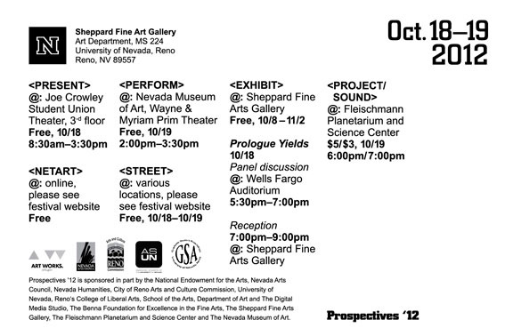
Exhibition Branding and Product Website
Prospectives is an International Festival of Digital Art held and organized by UNR triennially. It highlights the work of international graduate students, Phd candidates and artists from around the world working across all disciplines utilizing experimental digital media. It’s a two day series of interrelated events held at the University of Nevada, Reno, and is free to attend for general public.
The Prospectives website, marketing materials and the brand in general didn’t represent the values and the level of the festival correctly. People didn't have a clear idea what is it about.
Create a brand with a clear focus on modern art and digital media properly communicating its level and focusing on students and young artists, community. Attract more people including students, local artists, potential students and general public. Establish the guidlines for the future events.
The stakeholder liked this project of mine (Black Angels) and was inspired to select a style which he would like to implement throughout the design: geometric bold forms such as in constructivism.
I led the design process, and implementation, worked with 1 developer and 1 production artist, worked together with the Director of the festival and Professor of Digital Media.
To understand the University education marketing, specific activities similar to the festival, to see how these events are structured and what content and information helps to attract new enrollments, I conducted market research.
Surveys and Interviews: To understand an attitude of visitors and participants of previous festival I talked to professors, some artists who participated at the past events, and some of the curent student participants who were accepted to present at the festival.
I asked what they think about the festival, what is/ was important about it. After these interviews I could understand an actual value that the festival embodied.
Result: This analysis helped to determine what type of brand to create, what to highlight and how to promote the event. It was clear that the event should promote the idea of community and highlight all the participating artists, demonstrate their work and be eye-catching in terms of design, be related to modern and digital art. Ideally, it should also help the audience to find a way to know more about the UNR Art Faculty, and, possibly, be the lead to the Art Department website.
People ages 15-32, art students, artists, high school students as prospective Art courses applicants
Educational organizations (schools, museums, art communities)
5 of 5 didn’t understand what the website is about
5 of 5 couldn’t recognize that it’s a big international event
3 of 5 assumed that the website/ poster concept is a high school project
3 of 5 couldn't distinguish the website from the poster (the two were shown from screen)
We continued exploring. I wrote down all the replies and distributed them into groups based on the commonalities. I separated the most representative phrases I heard:
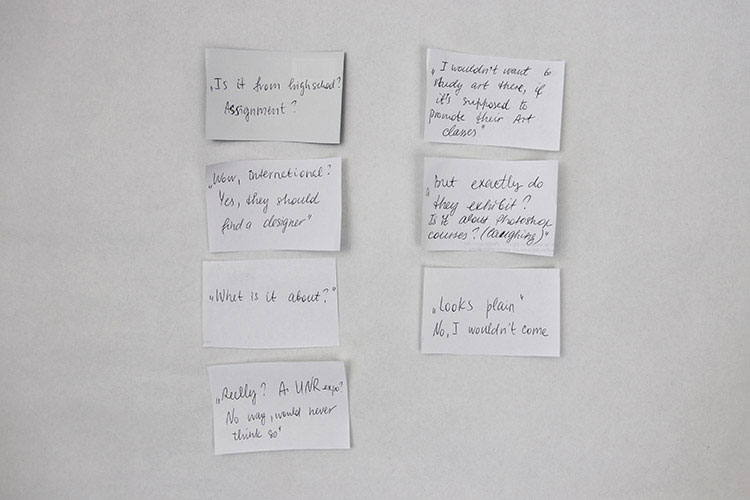
After this excersice two global issues were found:
As an international festival with artists from more than 20 different countries, showcasing the work of 40 artists (27 of whom were invited from abroad to attend and participate in the festival), it totally failed to correctly represent its capacity, purpose and goals.
Vsitors didn’t perceive this festival as a significant educational and entertaining event, festivals #1 and #2 were approximately the same in attandance and didn’t seem to grow, it’s questionable if the addendance will stay the same.
Based on the discovered issues the following assumptions were made:
A strong and visually infromative brand will communicate its direct relation to modern art and digital art education. The festival could become well recognized among the other University events by its identity and the event style – by staying consistent within the brand messaging and guidelines in the future.
By placing the UNR logo on each page of the website and on all the marketing materials we will promote UNR in a subtle way.
Well developed imagery and brand will communicate the level of the event correctly.
Establish Festival Authority and build trust, show the focus on modern art and digital media, students and young artists
Help building the community
Increase attendance, attract more people including students, local artists, potential students and general public
After our research and data analysis I was able to make an assumption concerning the design and strategy. As usual, all the data was saved to evaluate in the near and long-term future.
Building a stronger brand, showing its values, quality and level of work, will increase the festival attendance, it will establish authority and build trust.
Need to create a better symbol that could be reused each festival (statue). Make a design style that could be used as a guideline, example.
Creating better on-campus marketing within the budget (posters, LCD screens) will contribute to the attendance growth.
Creating a website that could encompass the idea of the festival, mixing art with digital, and at the same time could be screened on a large wall as an exhibit during the expo, will attract more visitors and will be more memorable.
Including a Sign Up button for Art Department field-trips (the button would lead directly to the Art Department website – calendar and form to fill out) will increase the number of field trip requests and hypothetically – enrollment rate.
Thinking of the listed above, we kept in mind the budget, technical and organizational capabilities.
User Value
Mutually beneficial collaborations
Artists’ exposure
Community building and support
Introduction to the various Art courses
Business Value
Increased attention to the Art Faculty (that would lead to more student applicants, more event sponsorships in the future)
Strengthening the festival authority
Measurement of Success
High attendance
Collaboration opportunities for artists as a result of attention to the festival and its participants
Growth of local art community
Increased interest in Art Department events and courses (can hypothetically result in higher enrollment count)
Work on festival branding, design all the brand tools (symbol, logo, website, other materials)
Conduct brand excercises with the team and stakeholders to understand the brand and establish the correct philosophy and imagery
Create the marketing campaign and materials within the available budget
Iterate and test designs again, launch and validate
We did a closed card sorting with the students, local artists and gallery curators to validate the existing categories which were reused each festival. We conducted a test with 15 people, one participant per test, to see if all the actegories weere clear for people.
We arranged the content into preset categories and asked the participants to sort the projects into these groups. We needed to find out if people understood what each category is about, find unclear labels and fix them using other ways except an actual name change (art pictures, better work examples) – some of the categories were already announced and it wasn’t possible to change these labels.
7 of 10 categories tested positively, most of the participants could guess what the categories were about
6 of 15 people were confused what’s the difference between “Exhibit” and “Present”
During the card sorting we discovered why people group particular artworks into certain categories, and it helped to generate ideas for how to make the “Present” category more clear since we couldn’t change the label – we replaced the photo with the video that clearly showed and presented this type of category. It also helped to decide what types of artwork to present on the website (have more videos rather than photos).
I used the Verbal+Visual Technique to establish the brand essense and philisophy, understand more clearly the TA
We asked the stakeholders:
Why are they organizing this festival and why do they believe in their ideas. Why should people attend and participate. We recoreded their responses to later organize into a single sentence.
To list 5 words that describe this event as a company, and 5 different words that they believe encompass the brand (Company refers to the organization that markets and produces this festival; Brand refers to the image and “personality” the stakeholders apply to this event).
To define their TA as precise as possible.
To go through 30 cards with words and sort these words into 4 groups relative to the company and brand: “what we are”, "what we are not”, “what we’d like to be”, “doesn’t apply”. It helped to define the brand’s characteristics.
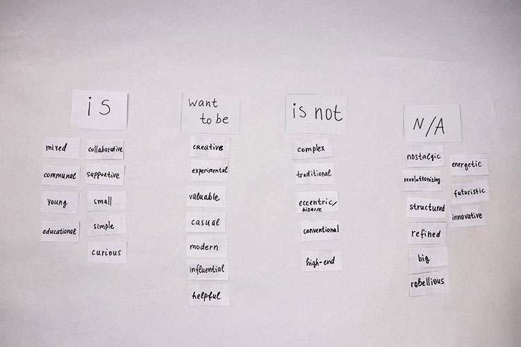
We had everyone write a 6-word story about the festival. We suggested to tell a story based on the previous festivals to make it easier to compose. This exercise helped to come up with ideas for promo materials and gave clues where to better locate them.
We checked the ideas and stories against the parameters (brand words, company words, and target audience) to make sure we still are focused on the right idea and goals.
Finalized ideas after the workshop:
The festival helps to connect artists from around the world with global art communities. Promotes collaborations and exhibitions, sponsors some selected artists, curates and organizes events to better represent the community and specific artists. It’s collaborative and very supportive, as well as educational. It represents artists working in several directions, mixing the traditional, modern and digital art.
After our workshop we were able to define the Core Values of the festival and form the Positioning Statement. With the stakeholders we also brainstormed the Brand Essense, Vision and Mission Statement.
Defining the main idea Prospectives festival wants to be known for
Developing the visual and verbal brand messaging
Cultivating the right partnerships with galleries and museums
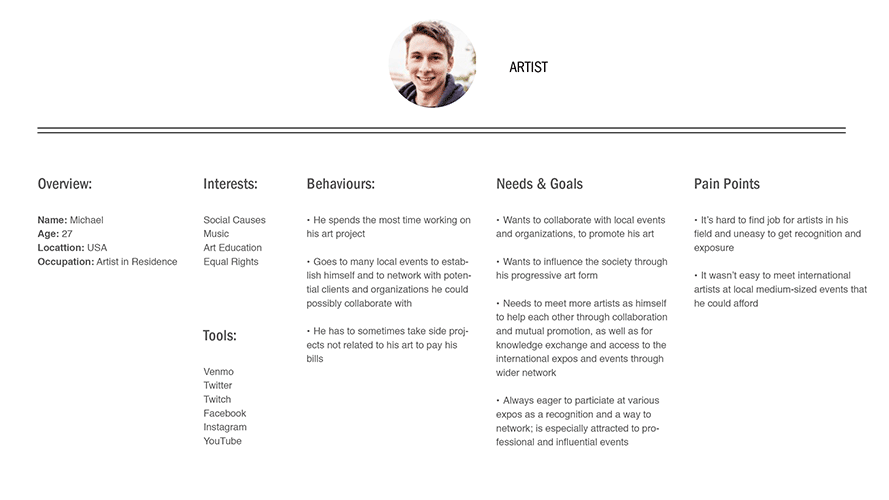
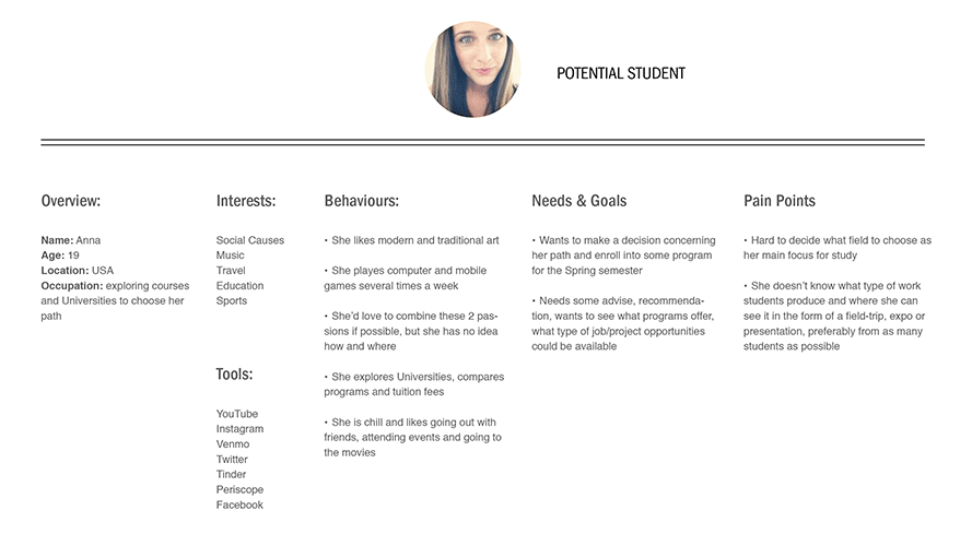
Based on the research we created 2 personas that showed who the potential Prospectives visitors are: their behaviors, needs, goals and pain points.
Planning
Together with the stakeholders we created a roadmap and a timeline for this project, we discussed who is responsible for which elements of the project, and established key milestones. We had only two months to create, test and complete the project.
Inspiration. Understand, Ideate and Define
I organized the work based on Design Thinking and HCD techniques, practiced Google Ventures Design Sprint adjusting the excersices to my team and our project.
Working on Prospectives I immersed myself into the local art life to know more about the organizations and artists, their plans, desires and problems. We invited stakeholders and gallery curators to talk about their exhibition practices, artist selections and event promotion. I also made sure I understand the resource flow and how, why and by whom the event was funded. It helped to better understand the business goals and frame the capabilities.
With the team members and stakeholders we practiced “How might we” technique to inspire the creative thinking and avoid pressure. Some of the statements are documented below.
How might we...
Improve the website appearance
Increase attention to the event and attendance
Collaborate with more potential sponsors (museums and media)
Diverge and Decide
Next, we completed several excersices, each made individually, such as "8 ideas in 5 minutes", "1 big idea in 20 minutes" et c. Next, we shared our ideas and voted on them. To make the creative process, the voting, and idea sharing successful, the following was suggested:
No judgement
Any ideas at all and especially crazy ideas are highly encouraged
Build on the ideas of others
Stay focused on the goals
Be visual – write down on Post-its and then put them on a wall, draw, write
Aim for quantity – generate as many ideas as possible
We discovered the Design Principles: “Merge traditional and digital art” and crafted insight statements, some were:
Potential students would like to see examples of exibits on the website
Potential students would like to be informed that they could apply for a field-trip, meet faculty at the expo
We reviewed all the ideas from our diverging phase and chose the best options, as usual we voted (dot voting). We choose 3 ideas to do a lo-fi prototype of the website, make mood boards and work on the visual part of the brand including two possible branding tools – a short motion graphics video and posters.
Products and brands are always part of the ecosystem. To identify this ecosystem and make sure everything is designed to work as a whole, we developed scenarios to see the possible situations that would lead people to visit the festival website, what would happen before, during and after. The scenarios were based on the previous festivals and used the previously developed Personas as main players.
Potential Student/ Visitor:
Anna goes home after classes and sees Prosepctives posters on campus (it's prominent, bright, and visible from the road). She stopps by, reads the poster, scans the QR code and proceeds to the website, reads the short description, checks the categories and watches some videos – the work examples. She likes the artists and finds the website unusual, and decides to visit the event.
Artist:
Michael is preparing for his exhibition at Prospectives’12. He is proud and feels lucky and happy to be selected to showcase his project to the University students, Professors, Museum and Gallery curators, and general public.
He is working on setting up his exhibit for tomorrow and wants to send the link with the schedule and the address to his friends and family, and to newly made acquantancies, to show when and where they can see him. He goes to the website and finds the event that he is exhibiting for. He sends the link – mission accomplished!
After the festival he wants to keep an artifact of the festival that has his name as participant. He was given a postcard which he can take home and put into his portfolio and exhibition list. He as well will use the website links with his name to put into his portfolio.
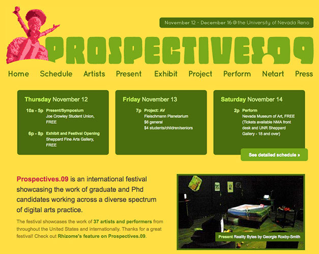
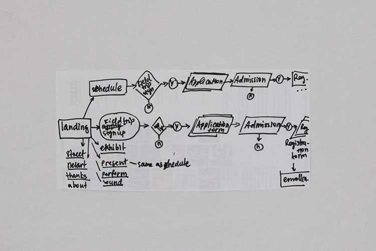
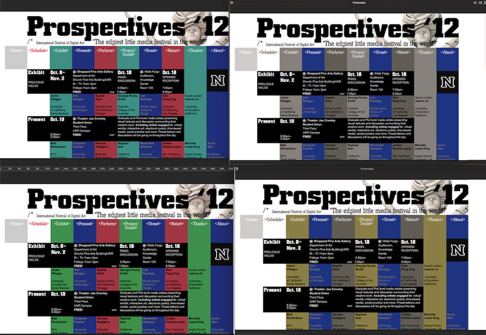
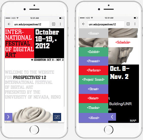
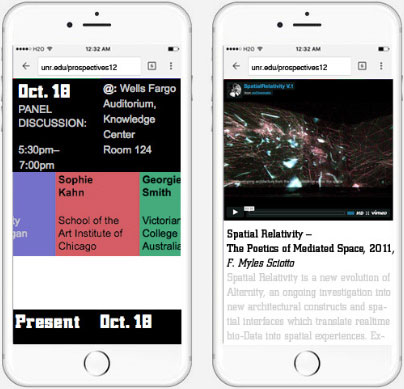
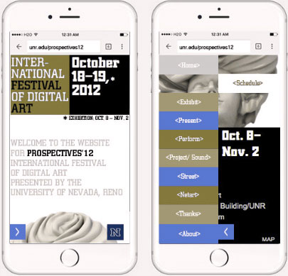
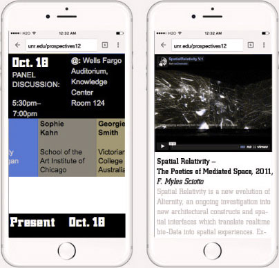
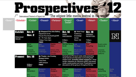
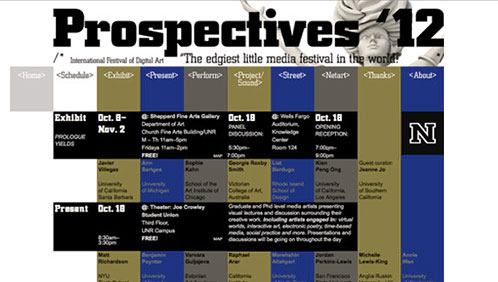
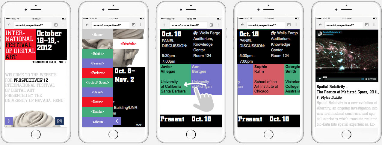
We decided to make the website as simple as possible in terms of user flow. It would be an sonline schedule presenting all of the participating artists, their names, and showing the selected works.
It would also contain a Sign Up button to apply for a UNR Art Department field trip, which would appear after a person spends 30 seconds on the website. We visualized a basic flow.
While working on the Prospectives website, we still had our big picture of the plan that would work as following: "Sign Up for the field-trip" button would lead to the schedule and "Sign Up Form" that is located on the UNR website. The Submit page on the "Sign Up Form" leads to an Application, Application leads to Admission – the last stage before Registration/ Enrollment.
Various visual and verbal content that reflected the nature of the event was gathered to create the visual design concept that would evoke the right feelings and have an emotional appeal. Below are selected pictures from the mood board:
We determined what content should be available on each page, selected the most descriptive projects to place on the website.
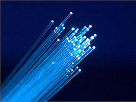
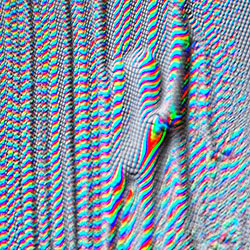
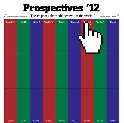
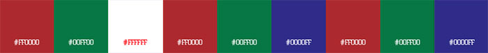
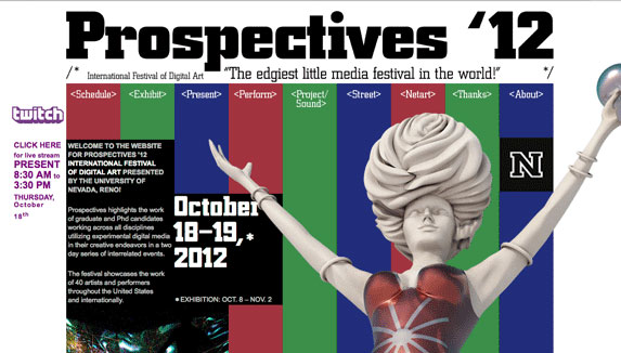
After exploring the selected ideas from our workshops and research, and after getting feedback on our first design paths the main idea was established, it was decided to use the RGB theme throughout the design: in forms of Pixels, RGB, LED screen, glass—monitor, optical fiber, impulses et c.
RGB creates colors such as many interrelated projects created the whole festival and gave life to more collaborations, as well as fully matched the idea of "digital". We decided to definitely use color for the event branding, but keep the layout geometric and bold.
The first question that arised when everyone was positive with the RGB idea was that colorblind people won't perceive these colors correctly. So I questioned this decision and made a research on how peopel with color vision deficiency.
I conducted a research on color blindness and since there are many types of color deficiency, a large number of colors can be considered not accessible for 100% of people. So I decided to go deeper and get some facts to go from there:
Red-green color blindness (Protanopia) is the most common, followed by blue-yellow color (Tritanopia). Approximately 8% of men and 0.5% of women can be affected.
Next, I considered the size of the event – knowing the number of people attending the expo in the past, the current participants, their gender, and the percentage of affected people, it was possible to calculate the approximate number of attendees who might have the color deficiency.
An interesting fact was that one of the stakeholders had a color dificiency himself which he told later on, though it didn't prevent him to select this design in the first place. That validated that the layout and the presented design was not an issue for people with specifics of eye vision.
A major criteria of designing for color blind people is contrast – it should be good enough and colors should be checked by tone to make sure the text is readable and the website is still usable despite the misrepresentation of color.
One of the reasons why it was decided to keep the RGB idea is that the webite is supposed to be conceptual and act as a part of an expo when screened on the wall. More of this will be covered below.
The second iteration of the design was created concentrating on the selected theme. Among the versions was a resemblance of a magnified screen with huge pixels, a magnified arrow and pointer. The red, green and blue colors were adjusted to be comfortable for eyes, but still were easily recognized by stakeholders and other people with normal vision as a screen or RGB. Thoughout the whole design process I went though a series of color adjustments and tests before selecting the final palette. The process will be covered later in the case.
To make the website accessible and avoid confusion, I decided to not use color as a category indicator, but locate the sections one by one such as on screen, just zoomed one.
As well, the layout design itself and typography can conpensate the color misrepresentation. As a hint for people with color deficiency, when scrolled down (and due to the amount and type of material they definitely scroll down – it was tested) the website footer contains the HTML color codes for RGB, which would be recognizable for people working in digital media or the ones who are related to the computer and web design – so everyone from TA would be covered.
A square was taken as an equivalent of pixel and as a component. 1 square was used for minimal amount of information, a combination of several squares that can build up, was used for more text.
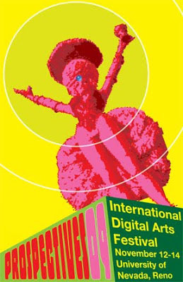
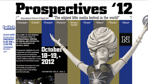
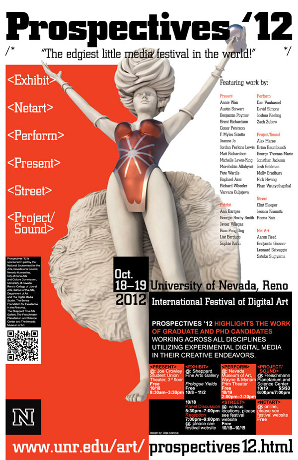
After the main design direction was established, it was the right time to work on the festival symbol.
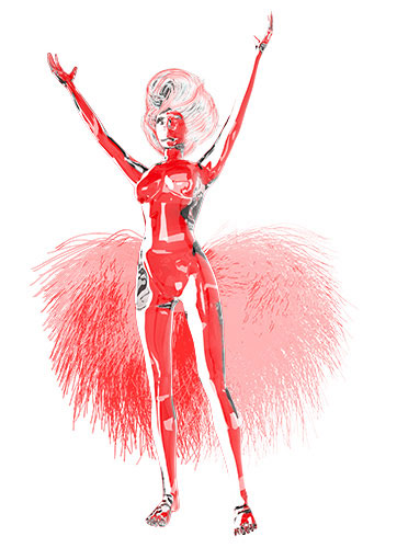
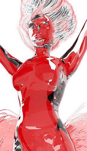
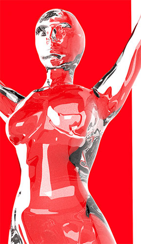
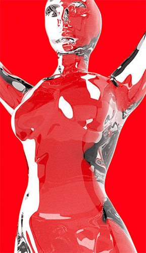
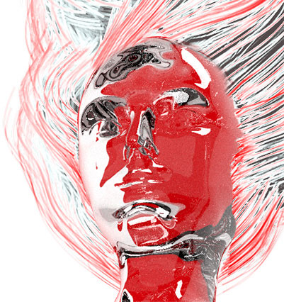
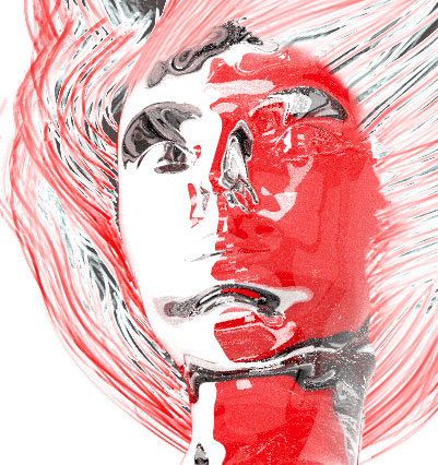
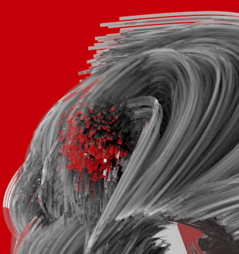
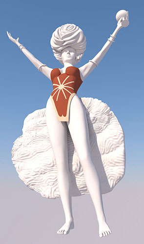
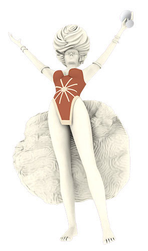
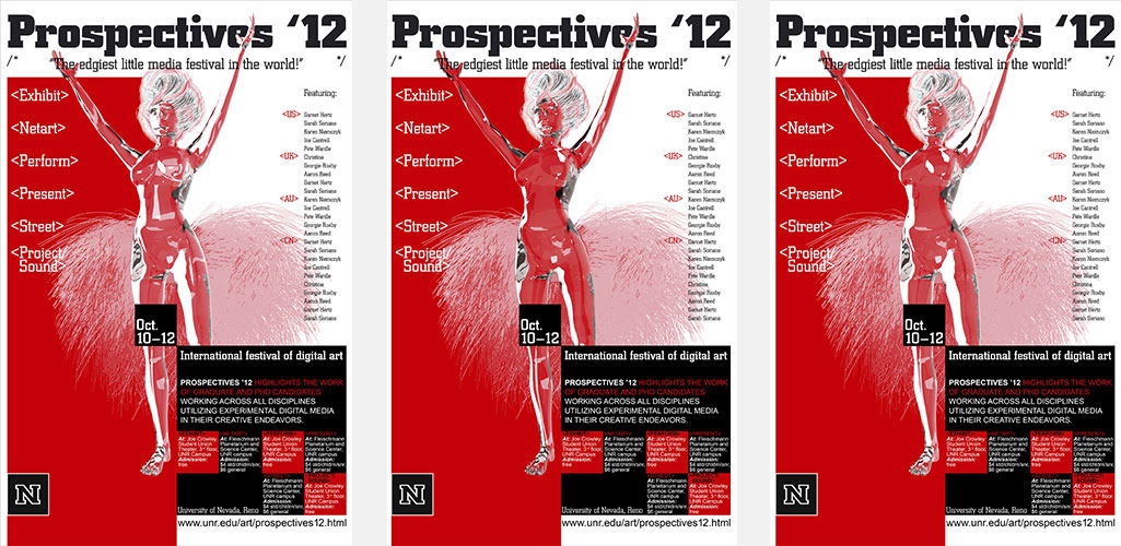
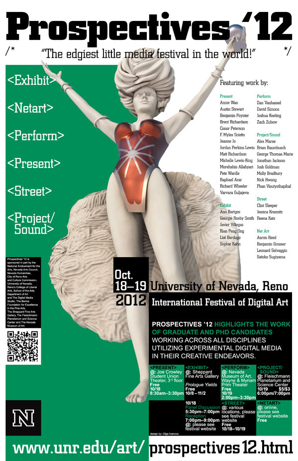
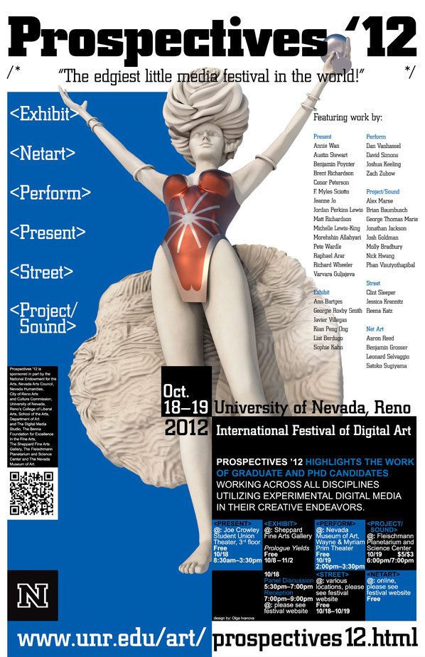
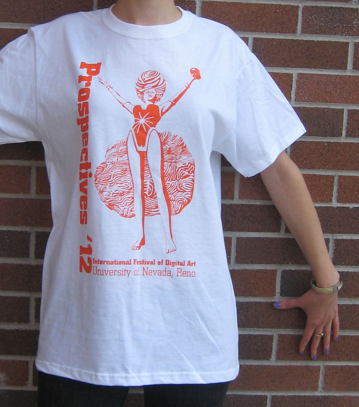
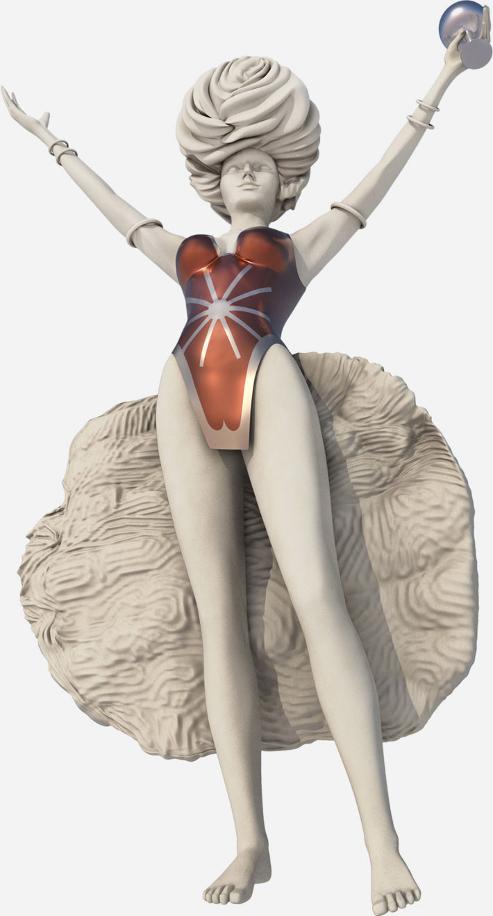
The symbol of the festival is a statue from a small photo. It was always present during all years of the festival and became a permanent attribute of this festival. There were several concerns about this picture: copyright, if use the photo directly, and quality – the concern would arise even if we would purchase the original photo – it was still too small. The photo is below.
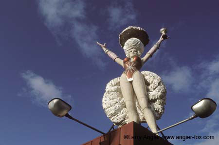
As a solution I proposed to build the statue in 3D and to create 2 versions:
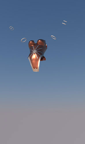
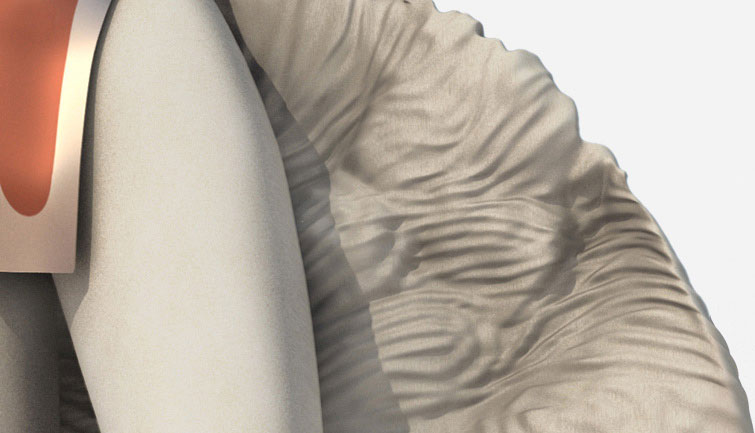
1. One – more realistic in terms of anatomy, with a glass or plastic texture, with many reflections. Hair and skirt would represent optical fiber and nerves – the way we perceive information. This statue would be placed in front of pixels, monitor in form or reflection, water-like structure or just as a semi-translucent glass.
Several iterations of this figure were made and some can be observed below. I rendered in Cycles Render to create a glass and plastic look, worked with different backgrounds and materials, tested various lighting to determine what would work best.
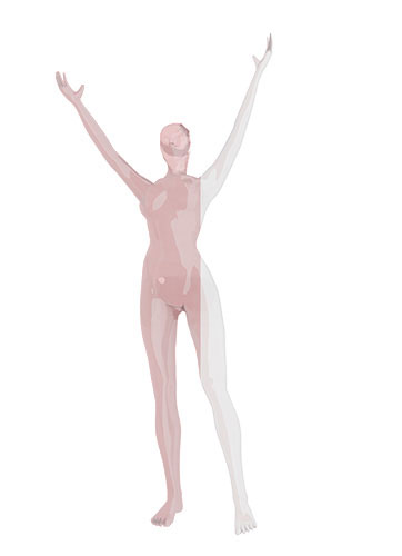
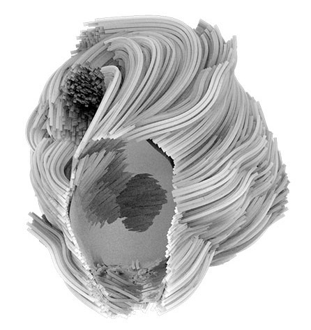
2. The second version was created from the photo – I tried to be as close to the original as possible, building a 3D copy of this figure, build from the original photo.
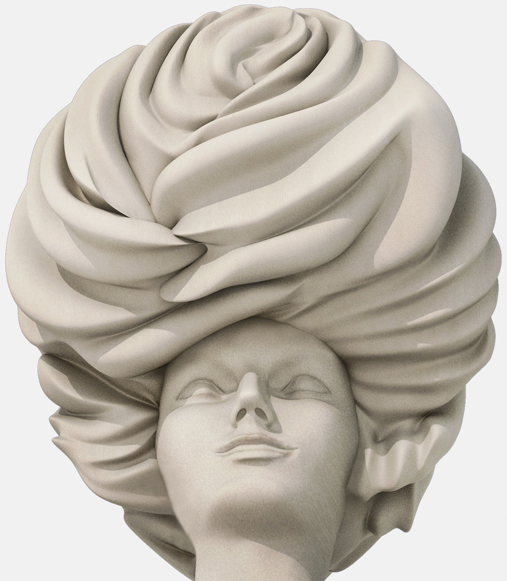
I used sculpting mode in Blender to work on the skirt, as well as in my final steps of work on the face. The Metallic suit was rendered with Lux Render.
Since the time for the whole project was very limited and the render time was high, because there was no animation involved in this figure, it wasn't crucial spending time on retopology (geometry optimization), even though it would be ideal. Since it would be used from one perspective and always static, I prioritized being on time with the whole project.
We chose Coliseum as a font of the logo, because it reflected the mood and the bold and square forms of this font looked harmonized with the pixel design theme we selected.
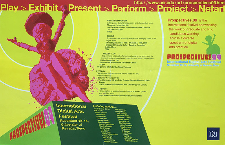
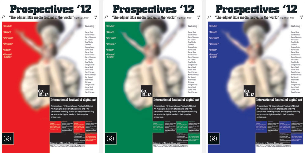
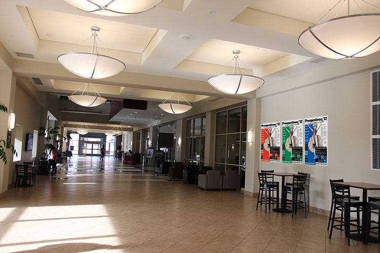
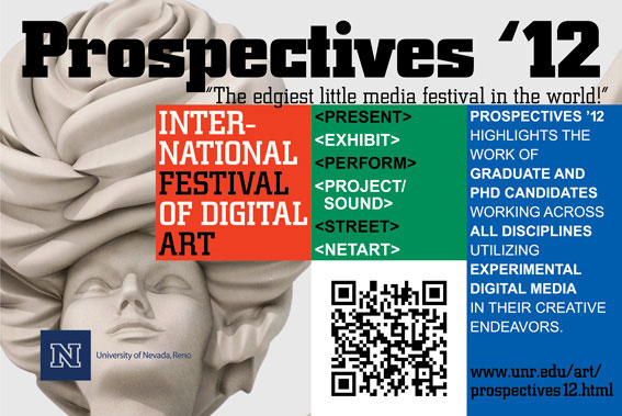
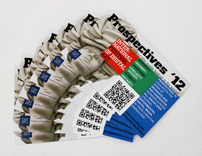
We decided to choose posters, postcards and T-shirts as marketing materials, utilizing the same RGB idea. Posters caught more attention if all 3 colors were positioned all together in a row on the wall. To be sent by mail as intended, the posters were designed to be folded in a way to show the main big black square with the information.
Thereby, the whole idea combined Digital (RGB, pixels) and Art (statue — something more refined and delicate).
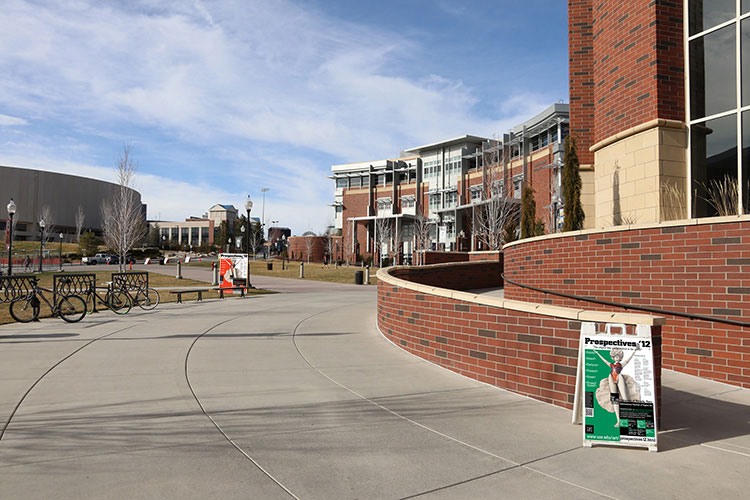
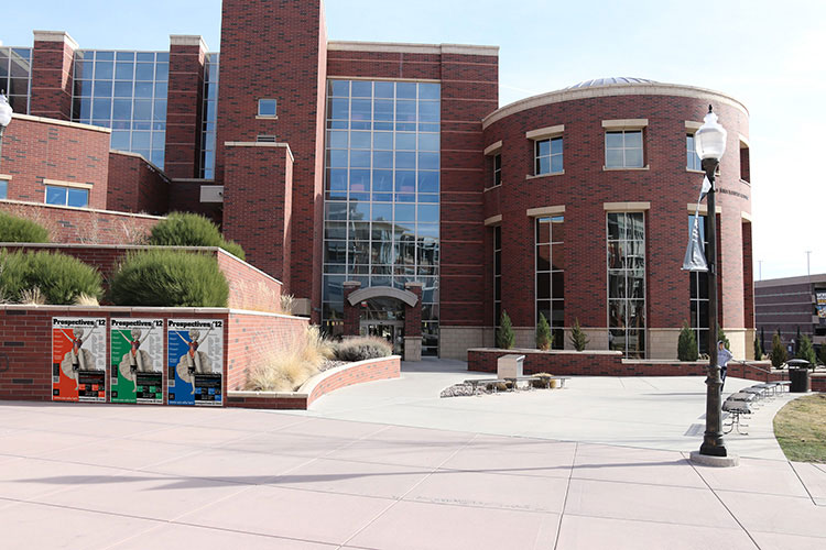
The posters were printed in 2 formats – 3 posters as large banners (one color of each) and the rest – as smaller paper posters to place indoors, outdoors and to be sent by mail. The posters were placed indoors and outdoors in the direction of the crowd flow in most popular places of the campus. Posters contained QR codes so people could scan it to access the website for more information quickly.
The colors in print materials and website were slightly different (print was lighter), but after analyzing the process it was clear that they wouldn't be seen together side by side, meaning that the posters would always be seen separately from the website. When people would open the website it wouldn't cause any questions. During our tests no participant asked anything or expresssed misunderstanding that could be related to the color difference.
It was decided to give up the idea with motion graphics due to the time constraints, and instead to screen the website on the wall.
Poster versions:
We decided to test the 3D figure as a festival symbol and showed our iterations to the stakeholders and students. The stakeholders gave a very positive feedback to the pixel-screen website and posters but were uncertain about the glass statue. They leaned towards the 3D copy of the photo because it was an established symbol of the festival, as well as the glass figure was found a bit too realistic looking, so the 3D copy was considered more appropriate for the event. The stakeholders were happy to have a copy of their beloved symbol in 3D and embraced the ability to reuse it at the next festival.
When showed to the artists and potential studens the opinions split 5/5 between the symbols: some liked the glass structure and reflections associating it with modern and digital, the others agreed that if we had an opportunity to have a 3D version of the original figure, we could keep the symbol unchanged.
It was decided to go with the stakeholder’s observation and implement the second version of the statue. I worked more on it’s texture and forms, getting feedback and iterating several times.
Because the website was intended to be screened on the wall, as well as to be an actual online website with the schedule and art works, it was important to test it for both, visual design that should be bold and bright, and usability – people should be able to find the schedule and read the information, we conducted 2 rounds of tests, each round had 5 participants. Interviews were held at UNR.
Interviews included:
Attitudinal test to see what people would say about the project and design
Visual Affordance test to make sure people know that they can interact with the website and check each section, to see if the "Sign Up" button is recognized and noticable
Tasks completion (based on scenarios)
The attitudinal test showed that 5 of 5 thought it’s related to some art or creative event.
As mentioned before, it's critical to test the contrast of the elements to make sure the website is accessible for color blind people. It's possible to test the contrast in grayscale mode, but through my research I found dirrefent software that helps to preview different types of color blindness. I used one of such applications to test the color Hues of the website to preview different color blindness types and make sure the text is readable.
For several larger descriptions and texts we used the light gray background for comfortable reading.
The whole idea as well very well matched the goal to make a visually unusual website that could be screened on the wall during the festival.
The information on the website was mostly presented in small chunks and the type was large, so the bright background didn't prevent people from being able to comfortably read and find the information they needed.
Below is the process of color comparison using a special software.
On the left – viewed as a person with normal vision,
on the right – as a person with Protanopia (green-red color blindness).
After a series of adjustments and color iterations we selected 2 versions (presented above), then narrowed down to the one in the 2-nd row, which is more bright and looks more aligned in terms of the color vibrance comparing to the colors in the 1-st row (specifically, the color deficiency view).
Both of the versions were readable and comfortable for eyes for people with normal vision, and I first was leaning towards the less bright one, but after comparing and testing both versions it was decided to go for a tradeoff and select the second, more bright version to keep the categories at the approximately same level of information (in the other version the blue color starts to pop and these sections might confuse by convincing they are CTAs).
For the mobile version of the website, the colors were adjusted and made lighter and brighter. It was made to increase readability that decreased because of the size and layout change. The scale from desktop - to mobile required some slight adjustments.
Similarly, the colors for print were adjusted separately following the profiles and specs of the selected print company.
After all the tests we grouped the results on the whiteboard to discover the areas to improve and to confirm the other parts.
To Improve:
People could understand that they could Sign Up for the field trip (3 of 5 people). But not all were sure where – either on the website or at the event. As a solution, we made the Sign Up button more prominent, made sure people are clear that it’s a clickable button.
Tested Positively:
People could find the schedule and read the address of a particular event (5 of 5 people)
People could successfully finish the given tasks (5 of 5 people)
People always knew what section they were looking at (4 of 5 people)
People could understand how many steps it would take to sign up (4 of 5 people)
5 of 5 people were could see what type of event it was and were clear that it’s a real event, not a school project
People liked the design of the website and the new branding (5 of 5)
During our last testing the "Sign Up for the field trip" button was tested positively – it was prominent – the motion and the bright color caught attention, and it was obvious that it’s a button. (5 of 5 people)
To validate the idea we went to TMCC college to meet with several potential students who were specializing in art. We had 4 interviews showing students the website, 2 of these 4 people did actually sign up for the field trip and told they would come to the festival.
Before the tests I introduced myself and everyone and offered to sign a consent form. Using these forms we were able to confirm that the students we interviewed did attend the festival – we could find their names on the attendee list when we checked the attendance.
We also showed the website to the festival participants (4 artists) and they all found the design very well matching the theme of the festival and expressed the opinion concerning the design being strong and professional. They were able to find the schedule and the event without any difficulties, as well.
The final version of the festival branding can be seen below.
We checked the number of attendees and compared to the previous events. This event was larger than the previous one. The branding in general, and brand tools such as website, posters and other marketing materials, as well as the strategical placement of the posters played a significant role in the attendance growth. We were able to prove it by surveying some of the attendees and learning about how they found out about the festival – I asked people to fill out short surveys right after the event. Not all attendees filled out the survey, but we were able to confirm that the new brand and design had a very positive impact. The stakeholder was very satisfied with the design and accomodation of the geometric constructivist forms with a modern layout.
Assumptions:
A strong and visually infromative brand will communicate its direct relation to modern art and digital art education. The festival could become well recognized among the other University events by its identity and the event style – by staying consistent within the brand messaging and guidelines in the future.
By placing the UNR logo on each page of the website and on all the marketing materials we will promote UNR in a subtle way.
Well developed imagery and brand will communicate the level of the event correctly.
Building a stronger brand, showing its values, quality and level of work, will increase the festival attendance, it will establish authority and build trust.
Need to create a better symbol that could be reused each festival (statue). Make a design style that could be used as a guideline, example.
Creating better on-campus marketing within the budget (posters, LCD screens) will contribute to the attendance growth.
Creating a website that could encompass the idea of the festival, mixing art with digital, and at the same time could be screened on a large wall as an exhibit during the expo, will attract more visitors and will be more memorable.
Including a Sign Up button for Art Department field-trips (the button would lead directly to the Art Department website – calendar and form to fill out) will increase the number of field trip requests and hypothetically – enrollment rate.
Results:
Confirmed. After our usability studies it was clear that people recognize the event as art and design related, something contemporary.
Confirmed. All the local people and visitors immediately noticed that the event is organized and sponsord by UNR.
Confirmed. During our studies every participant assumed that the event is an expo, none thought it was a high-scholl project, as before.
Confirmed. The attendance was higher and visitors were impressed by the drastical change of the event presentation. The new visitors liked the event and always treated the event with big respect.
Confirmed. All the stakeholders were positivly surprised when I suggested to build a 3D copy of the figure, and felt that the huge problem for the future design was solved (from in-person interviews).
Confirmed. Surveys showed that the large number of attendees found out about the event from different marketing materials.
Confirmed. The visitors were amused by the idea and spread the word about the festival – in a way doing a marketing for the event. The website was projected on the wall together with the Twitch live streaming of key events.
Concept of doing field trips was not implemented in the final version of the website due to the various conditions related to the faculty. The Sign Up button was removed. Despite this, the festival had a positive influence on the Art Dpartment, increasing attendance and collaborations.
The Fesitval could very clearly answer the “ What will I get?” question – one of the most important and valuable information the prospectives students consider when choosing the University and Faculty. It showed the students’ work and their collaboartions with museums and art organizations.
As one of the stakeholders previously said: “Our festivals should reflect the quality of the institution and a focus for supporting statewide and international digital artists.” – the new brand helped to communicate it and to establish Prospectives as a professional event helping artists to join the community and get exposure, and demonstarting their creative work to prospective students.
P.S.: the presented work is part of the campaign. More marketing pieces such as brochures, postcards and souvenirs were created by the team.
User and Market Research; Brand Strategy; Branding Techniques and Workshops; Product Design; Design Sprint; Visual Design/3D/UI/UX; Usability Studies; vendor research, vetting and communication; woking within the established budget
© 2018 Ol-iva